The Dev’s Guide to Customizing and Extending Editor SDKs

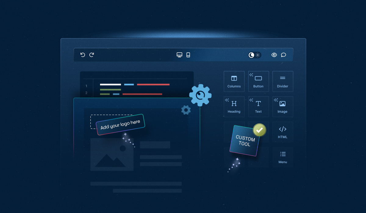
Dropping in an editor SDK takes minutes. Making it feel like it belongs to your product—that takes skill.
It’s more than just embedding and integrating the editor—it’s about matching your design system and keeping content on-brand.
This is where customizing and extending editor SDKs makes sense, giving developers full control to turn a generic tool into an editor that feels truly native.
In this guide, we’ll explore how developers can achieve complete control from customization (white-labeling, theming, behavior, and UI/UX controls) to extension (building bespoke features and workflows)—using Unlayer as a practical example.
Difference Between Customizing and Extending Editor SDKs
Customization is about making the editor look and behave like part of your product. This includes changing themes, layouts, default content, or branding so it feels native—without altering the editor’s core features.
Extension is about adding new features or workflows that the editor doesn’t have by default. This could be custom tools, dynamic content, event handling, or API integrations that expand what the editor can do.
In short, customization changes how the editor works, while extension adds new capabilities. Together, they let you make a generic editor feel fully integrated and tailored to your product.
⚙️ Customizing Editor SDKs With Branding, Theming, & Enhanced UI/UX
Tailor the editor’s look, behavior, and functionality to match your product—without altering the editor’s core SDK.
1. White-label editor SDK
Remove Unlayer’s default branding and make the editor feel fully native within your product by enabling white-label mode. This requires a paid project ID and domain whitelisting in your Unlayer account.
✅ To get started:
1- Whitelist your domain in the Unlayer dashboard
2- Use your paid projectId when initializing the editor
3- Optional: Once the Unlayer logo is removed, you can:
Add your own branding using Custom CSS inside the editor, or
Place your logo outside the editor, elsewhere in your app UI
⚠️ Without a valid projectId and whitelisted domain, Unlayer branding will remain visible.
2. Appearance
Controls how the editor looks to end-users.
✅ Themes
Theming an editor SDK means defining the visual styling of the builder interface.
Select from built-in options
Unlayer offers four built-in themes: modern_light, modern_dark, classic_light, and classic_dark. You can configure a theme for the editor during initialization using the unlayer.init() method.
By default, the builder is set to modern_light:
unlayer.init({
 appearance: {
   theme: 'modern_light',
 },
});
You can change it to modern_dark on the fly like this:
unlayer.setTheme('modern_dark');You can even extend an existing theme and override its color, shape, and style settings. If all the out-of-the-box themes don't match your specific needs, you can create an entirely new look with Custom JS/CSS.
👉 Learn More Here: Themes Docs →
✅ Layout
It gives you control over the tool panel positioning and collapsing, providing flexibility in how the builder interface is structured.
Setting the panel on the right
The tool panel is positioned on the right by default:
unlayer.init({
 appearance: {
   panels: {
     tools: {
       dock: 'right',
     },
   },
 },
});
Setting the panel on the left
You can dock the panel on the left:
unlayer.init({
 appearance: {
   panels: {
     tools: {
       dock: 'left',
     },
   },
 },
});
Enable/disable collapsing
The tool panel is collapsible by default, so users can show or hide the panel as needed to create more space while designing.
However, you can disable collapsibility:
unlayer.init({
 appearance: {
   panels: {
     tools: {
       collapsible: false,
     },
   },
 },
});
📄 Layout →
✅ Loading spinner
Replace the builder's default loading spinner in the builder with a custom one using:
Animated image
Use a custom GIF or PNG:
unlayer.init({
 appearance: {
   loader: {
     url: 'https://example.com/loader.gif', // URL of the custom loading spinner image
   },
 },
});
CSS loader
Create a custom loader using HTML and CSS:
unlayer.init({
 appearance: {
   loader: {
     html: '<div class="custom-spinner"></div>', // HTML structure for the loader
     css: '.custom-spinner { color: red; }', // CSS styling for the loader
   },
 },
});✅ Custom CSS/JS
Custom CSS helps in branding, tweaking layouts, and styling the builder interface to fit your application's design language.
To add it to the builder, you have to pass a CSS string or URL to the customCSS option while initializing the builder.
unlayer.init({
 customCSS: 'https://example.com/custom-styles.css',
});
Or, pass the CSS source code:
unlayer.init({
 customCSS: [
   "
     body {
       background-color: yellow;
     }
   "
 ]
});
Want to customize behavior with JavaScript or fine-tune styles further?
👉 Check Out: Custom JS/CSS →
✅ Font management
Control which fonts are available in the editor to keep designs consistent and on-brand.
Note: Fonts are technically part of advanced configuration in the docs, but for styling consistency, we’ll cover them here under appearance.
Default fonts
Here are all the default fonts in the Unlayer editor, along with their configurations and the URLs for Google Web Fonts:
[
 {
   "label": "Andale Mono",
   "value": "andale mono,times"
 },
 {
   "label": "Arial",
   "value": "arial,helvetica,sans-serif"
 },
 {
   "label": "Arial Black",
   "value": "arial black,avant garde,arial"
 },
 {
   "label": "Book Antiqua",
   "value": "book antiqua,palatino"
 },
 {
   "label": "Comic Sans MS",
   "value": "comic sans ms,sans-serif"
 },
 {
   "label": "Courier New",
   "value": "courier new,courier"
 },
 {
   "label": "Georgia",
   "value": "georgia,palatino"
 },
 {
   "label": "Helvetica",
   "value": "helvetica,sans-serif"
 },
 {
   "label": "Impact",
   "value": "impact,chicago"
 },
 {
   "label": "Symbol",
   "value": "symbol"
 },
 {
   "label": "Tahoma",
   "value": "tahoma,arial,helvetica,sans-serif"
 },
 {
   "label": "Terminal",
   "value": "terminal,monaco"
 },
 {
   "label": "Times New Roman",
   "value": "times new roman,times"
 },
 {
   "label": "Trebuchet MS",
   "value": "trebuchet ms,geneva"
 },
 {
   "label": "Verdana",
   "value": "verdana,geneva"
 },
 {
   "label": "Lobster Two",
   "value": "'Lobster Two',cursive",
   "url": "https://fonts.googleapis.com/css?family=Lobster+Two:400,700"
 },
 {
   "label": "Playfair Display",
   "value": "'Playfair Display',serif",
   "url": "https://fonts.googleapis.com/css?family=Playfair+Display:400,700"
 },
 {
   "label": "Rubik",
   "value": "'Rubik',sans-serif",
   "url": "https://fonts.googleapis.com/css?family=Rubik:400,700"
 },
 {
   "label": "Source Sans Pro",
   "value": "'Source Sans Pro',sans-serif",
   "url": "https://fonts.googleapis.com/css?family=Source+Sans+Pro:400,700"
 },
 {
   "label": "Open Sans",
   "value": "'Open Sans',sans-serif",
   "url": "https://fonts.googleapis.com/css?family=Open+Sans:400,700"
 },
 {
   "label": "Crimson Text",
   "value": "'Crimson Text',serif",
   "url": "https://fonts.googleapis.com/css?family=Crimson+Text:400,700"
 },
 {
   "label": "Montserrat",
   "value": "'Montserrat',sans-serif",
   "url": "https://fonts.googleapis.com/css?family=Montserrat:400,700"
 },
 {
   "label": "Old Standard TT",
   "value": "'Old Standard TT',serif",
   "url": "https://fonts.googleapis.com/css?family=Old+Standard+TT:400,700"
 },
 {
   "label": "Lato",
   "value": "'Lato',sans-serif",
   "url": "https://fonts.googleapis.com/css?family=Lato:400,700"
 },
 {
   "label": "Raleway",
   "value": "'Raleway',sans-serif",
   "url": "https://fonts.googleapis.com/css?family=Raleway:400,700"
 },
 {
   "label": "Cabin",
   "value": "'Cabin',sans-serif",
   "url": "https://fonts.googleapis.com/css?family=Cabin:400,700"
 },
 {
   "label": "Pacifico",
   "value": "'Pacifico',cursive",
   "url": "https://fonts.googleapis.com/css?family=Pacifico"
 }
]
Custom fonts
Add your custom fonts using:
unlayer.init({
 fonts: {
   showDefaultFonts: true,
   customFonts: [
     {
       label: 'Comic Sans',
       value: "'Comic Sans MS', cursive, sans-serif",
     },
     {
       label: 'Lobster Two',
       value: "'Lobster Two',cursive",
       url: 'https://fonts.googleapis.com/css?family=Lobster+Two:400,700',
       weights: [
         { label: 'Regular', value: 400 },
         { label: 'Bold', value: 700 },
       ],
     },
   ],
 },
});
Font sizes
Control the range of font sizes available to end-users:
unlayer.init({
 features: {
   textEditor: {
     fontSizes: ['18px', '20px', '30px'],
   },
 },
});3. Editor behavior
Defines how the Unlayer editor responds to any user action.
✅ Blank design
By default, the editor loads with a blank design. This function resets the design to a clean state, letting users start from scratch.
You can also set a background color for the editor’s body here.
unlayer.loadBlank({
 backgroundColor: '#e7e7e7',
});
✅ Auto select on drop
Dropping a tool won’t select it or show its settings unless you enable this option using:
unlayer.init({
 editor: {
   autoSelectOnDrop: true,
 },
});
✅ Confirm on delete
By default, the editor does not show a confirmation message when a user deletes content in their design. If you have the undo/redo feature turned off, you should enable it.
To enable the feature, pass the following parameter to your initialization code:
unlayer.init({
 editor: {
   confirmOnDelete: true,
 },
});
✅ Undo or redo
The undo/redo option lets users revert or reapply changes in the builder, making it easy to experiment without fear of mistakes.
Enable or disable
Undo/redo option is enabled by default, but you can disable it with:
unlayer.init({
 features: {
   undoRedo: false,
 },
});
Note: If you choose to disable it, you should turn on the delete confirmation setting.
You can even control the undo or redo feature with several API methods, and for that,
👉 Check Out: Undo/Redo Docs →
4. Content settings
Let developers control the default styles and behavior of the content, such as:
✅ Body values
You can programmatically set values for the body panel options:
unlayer.setBodyValues({
 backgroundColor: '#e7e7e7',
 contentWidth: '500px', // or percent "50%"
 fontFamily: {
   label: 'Helvetica',
   value: "'Helvetica Neue', Helvetica, Arial, sans-serif",
 },
 preheaderText: 'Hello World',
});
You can also set default values for the body panel options. For example, here’s how you can set a default text color:
Text color
unlayer.init({
 tools: {
   bodies: {
     properties: {
       textColor: {
         editor: {
           defaultValue: '#ff0000',
         },
       },
     },
   },
 },
});
Unlayer also supports customizing background color, font family, content alignment, and font weight.
👉 Check out: Body Values Docs →
✅ Page title
Set a custom title for exported HTML using unlayer.exportHtml():
unlayer.exportHtml(console.log, { title: 'Exported HTML Title' });✅ Columns
You can decide how columns work—disable multi-column blocks for single-column layouts or add predefined columns for consistency.
Disable columns
To disable columns, use:
unlayer.init({
 editor: {
   columns: false,
 },
});
Predefined columns
Create a custom block with predefined columns by calling unlayer.registerColumns() and providing an array of column widths.
→ 4-column block
Create a block with four columns where the first and last take two parts each, and the middle two take four parts each:
unlayer.registerColumns([2, 4, 4, 2]);→ 3-column block
Create a block with three columns where the first two take three parts each and the last takes six:
unlayer.registerColumns([3, 3, 6]);👉 Check Out: Columns Docs →
✅ Headers and footers
Enabling this feature helps visually highlight the header and footer areas inside the canvas with distinct indicators so that users may know which part of the content they are working on.
This feature can be enabled by passing a feature flag during initialization:
unlayer.init({
 features: {
   headersAndFooters: true,
 },
});You can configure the editor to limit rows, set a preheader text, define page anchors, and even flag and fix design issues.
👉 Check Out Docs:
5. Advanced UI/UX controls
Get deep control over how the editor adapts to different users, devices, and design contexts.
✅ Localization & translations
Want to localize the Unlayer editor for non-English users? Unlayer provides built-in support for custom translations using JSON. You can also override translations as per your own requirements.
unlayer.init({
...
locale: 'en-US',
translations: {
'en-US': {
"tools.tabs.content": "Content",
"tools.tabs.row": "Row"
}
}
});
📄 Unlayer Translations GitHub Repo →
✅ Accessibility
With this feature, you can configure accessibility in the builder—for example, by setting a custom iframe title or assigning a custom title to exported HTML.
unlayer.init({
 editor: {
   title: 'Editor Iframe Title',
 },
});
✅ Preview designs
The feature lets end-users see how their content will look on mobile, tablet, or desktop, and even across different email clients. This ensures responsiveness and compatibility while allowing devs to customize or programmatically control the preview.
Enable or disable
By default, the preview icon appears in the actions bar.

You can hide it using:
unlayer.init({
 features: {
   preview: false, // Disable mobile/desktop preview icons
 },
});
You can show or hide the preview mode programmatically, allowing developers to control when the preview is shown and which device mode (mobile or desktop) is active. You can also customize the preview with Custom HTML.
👉 Just Check Out: Preview Design Docs →
✅ Responsive controls
The builder comes with a set of features to help developers and end-users handle responsive design more easily:
Change the default value for "Do Not Stack on Mobile”
Columns in a block stack on mobile devices by default. End-users can change this setting for each block:
unlayer.init({
 tools: {
   rows: {
     properties: {
       noStackMobile: {
         editor: {
           _override: {
             mobile: {
               defaultValue: true, // Default value for 'Do Not Stack on Mobile'
             },
           },
         },
       },
     },
   },
 },
});
Change the default value for "Hide on Mobile”
Hide specific elements on mobile devices to improve layout control:
unlayer.init({
 tools: {
   button: {
     properties: {
       hideMobile: {
         editor: {
           _override: {
             mobile: {
               defaultValue: true,
             },
           },
         },
       },
     },
   },
 },
});✅ Device management
The editor supports desktop and mobile devices. By default, it opens desktop mode. However, you can change it to mobile mode using:
unlayer.init({
 defaultDevice: 'mobile',
 devices: ['mobile'],
});✅ Tab management
To fine-tune the user interface, you can control which editor tabs appear, where they appear, and which one is active by default.
Enable or disable tabs
You can enable or disable any tab. For default ones, just use the tab name. For custom ones, prefix your tab name with custom#.
unlayer.init({
 tabs: {
   content: {
     enabled: true,
   },
   blocks: {
     enabled: false,
   },
   'custom#my_tab': {
     enabled: false,
   },
 },
});
Default active tab
When the editor loads, the "Content" tab is active by default. You can change it to any other tab.
unlayer.init({
 tabs: {
   blocks: {
     active: true,
   },
 },
});
You can also reposition tabs, change icons, or even create a custom tab, but we'll rely on the docs to cover all the possibilities.
✅ Text management
It gives you control over text editing functionalities, such as spell checking, tables, etc, allowing you to customize the text editing experience for your end-users.
Spell checker
The spell checker is disabled by default. You can enable or disable it with:
unlayer.init({
 features: {
   textEditor: {
     spellChecker: true, // Enable spell checker
   },
 },
});
Tables
The feature is disabled by default. You can enable it with:
unlayer.init({
 features: {
   textEditor: {
     tables: true, // Enable tables in the text editor
   },
 },
});
Unlayer also supports emojis, clean paste, inline font controls, custom buttons, and text change event triggers. You have to check out the docs for that.
✅ Color management
Configure and control the builder's color options to ensure brand consistency and flexibility for end-users.
Change the default color presets for the color picker:
unlayer.init({
 features: {
   colorPicker: {
     presets: [
       '#D9E3F0',
       '#F47373',
       '#697689',
       '#37D67A',
       '#2CCCE4',
       '#555555',
       '#DCE775',
     ],
   },
 },
});
You can even define custom color groups, set default color groups, disable or override existing color groups, and even update color picker configuration on the fly.
👉 Check Out: Color Management Docs →
✅ Link management
The feature lets you offer special links like “unsubscribe” and also control what types of links end-users can insert (URLs, email, phone, etc.).
Special links
Here's how to define special links. It also allows nesting.
unlayer.init({
 specialLinks: [
   {
     name: 'Manage account',
     href: 'https://[my-account]/',
     target: '_self',
   },
   {
     name: 'Frequently used',
     specialLinks: [
       {
         name: 'Subscribe',
         href: '[subscribe]',
         target: '_blank',
       },
       {
         name: 'Unsubscribe',
         href: '[unsubscribe]',
         target: '_blank',
       },
     ],
   },
 ],
});
Link types
Let’s add a simple https://google.com static link as an available link type. If a user selects this action, the button will simply open Google in a new tab.
unlayer.setLinkTypes([
 {
   name: 'static_google_link',
   label: 'Go to Google',
   attrs: {
     href: 'https://google.com/',
     target: '_blank',
   },
 },
]);
Unlayer also supports input-generated links, JS onClick links, file download links, enabling/disabling default links, and advanced link attributes for finer control.
👉 Check Out: Link Types Docs →
🛠️ Extending Editor SDKs With Bespoke Features & Advanced Workflows
With customization, you’ve made the editor look, feel, and behave like part of your product. But what if you need features that don’t exist out of the box? That’s where you have to extend the editor SDK.
Here’s how you can do that:
1. Create custom tools
Custom tools let developers create unique, user-defined components to extend the default functionality of the visual builder. This gives them full control over appearance, behavior, and interactivity.
They integrate seamlessly into the editor, enabling drag-and-drop configuration and advanced customization for diverse use cases.
For creating a custom tool, you first have to:
✅ Register your tool
unlayer.registerTool({
 name: 'my_tool',
 label: 'My Tool',
 icon: 'fa-smile',
 supportedDisplayModes: ['web', 'email'],
 options: {},
 values: {},
 renderer: {
   Viewer: unlayer.createViewer({
     render(values) {
       return '<div>I am a custom tool.</div>';
     },
   }),
   exporters: {
     web: function (values) {
       return '<div>I am a custom tool.</div>';
     },
     email: function (values) {
       return '<div>I am a custom tool.</div>';
     },
   },
   head: {
     css: function (values) {},
     js: function (values) {},
   },
 },
 validator(data) {
   return [];
 },
});
Custom tools can include tool properties, custom property editors, and widgets to control how users interact with them. You can also pass data from your application to custom tools and property editors.
For full examples and detailed steps,
👉 Here You Go: Create a Custom Tool →
2. Dynamic content
Dynamic content extends the editor’s capabilities beyond the standard features, allowing developers to create more personalized and flexible designs.
Related: How to Create a Dynamic Email Template With Unlayer?
✅ Merge tags
They let users insert placeholders in their emails that are replaced with real values when sent, enabling dynamic, personalized content; if no tags are provided during initialization, the merge button won’t appear.
Pass merge tags
unlayer.init({
 mergeTags: {
   first_name: {
     name: 'First Name',
     value: '{{first_name}}',
     sample: 'John',
   },
   last_name: {
     name: 'Last Name',
     value: '{{last_name}}',
     sample: 'Doe',
   },
 },
});
Group merge tags into sub-menus
unlayer.init({
 mergeTags: {
   shipping_address: {
     name: 'Shipping Address',
     mergeTags: {
       street_1: {
         name: 'Street 1',
         value: '{{shipping_address.address_1}}',
       },
       street_2: {
         name: 'Street 2',
         value: '{{shipping_address.address_2}}',
       },
       city: {
         name: 'City',
         value: '{{shipping_address.city}}',
       },
       state: {
         name: 'State',
         value: '{{shipping_address.state}}',
       },
       zip: {
         name: 'Zip',
         value: '{{shipping_address.zip}}',
       },
     },
   },
 },
});
You can even dynamically update merge tags, enable smart merge tags, add conditions and loops, preview, trigger an autocomplete menu, sort merge tags, export HTML with real values, and use a custom merge tag picker UI.
👉 Check Out More Here: Merge Tags Docs →
Dynamic content includes design tags, display conditions, and dynamic images, in addition to merge tags. We have detailed documentation on these.
👉 Here You Go: Dynamic Content Docs →
3. Blocks & templates
Easily reuse design components and manage templates to streamline your editing workflow.
✅ Custom blocks
Custom blocks extend the editor by letting developers provide reusable, pre-designed components that users can drag and drop into their designs. This ensures consistent branding and faster content creation.
Custom blocks are enabled by default. You can disable them using:
unlayer.init({
 features: {
   blocks: false, // Disables custom blocks
 },
});
You can create and load blocks either via the Unlayer Console or via the JavaScript API. Blocks can be reloaded dynamically, and you can hook into events like block:added, block:modified, or block:removed to handle custom logic.
👉 Follow step-by-step instructions: Custom Blocks Docs →
✅ User saved blocks
They let end-users save any block they create, making it reusable across multiple designs. This empowers developers to support advanced workflows like content consistency, repeatable layouts, and rapid design iteration.
To enable this feature, you need to set up end-user identification and enable custom blocks when initializing the editor:
unlayer.init({
 features: {
   blocks: true,
 },
});
Once enabled, users can save a block with a category name and optional tags, making it searchable and easy to reuse.
✅ Template management
Allows developers to offer reusable designs and streamline content workflows. Templates can be stored either on Unlayer’s servers using the Template Manager for easy collaboration or on your own servers for full control over storage and integration.
👉 For Code Snippets and More Details, Check Out: Template Management Docs →
4. Events & callbacks
Let developers hook into the editor’s lifecycle and user actions to implement bespoke features or advanced workflows that go beyond the default behavior.
✅ Editor ready
This event triggers once the editor is fully ready to use.
unlayer.addEventListener('editor:ready', function () {
 console.log('editor:ready');
});
✅ Design loaded
It is called when your design is loaded in the editor.
unlayer.addEventListener('design:loaded', function (data) {
 // Design is loaded
 var json = data.design; // design json
});
There are some other events that you call, such as “design updated” and “image uploaded.”
👉 Check Them Out Here: Events and Callbacks
5. AI configuration
This feature takes the editor further by automating tasks like creating text, buttons, headings, and images—helping developers speed up workflows and deliver a better user experience.
AI configuration is enabled by default, but you can disable it using:
unlayer.init({
 features: {
   ai: false, // Disables all AI features
 },
});
👉 To Customize Each AI Feature, Check Out: AI Configuration Docs →
Conclusion
That’s all about customizing and extending editor SDKs like Unlayer. With the right setup, you can tailor the editor to fit your brand and workflow needs perfectly.
So, give it a go.
Embed Unlayer!
Customize. Extend. Scale.
FAQs Related to Customization and Extension of Editor SDKs
Q1. What is visual branding?
Visual branding is the consistent use of design elements, like fonts, logos, etc., that represent a company or product.
In an editor SDK, this ensures that the interface, blocks, templates, and outputs all reflect your brand identity, so everything feels consistent, polished, and professional for both developers and end-users.
Q2. Does Unlayer offer roles and permissions?
Yes, Unlayer provides role-based access controls that let you manage what different users can see and edit within the editor. This ensures secure collaboration and prevents unauthorized changes.
Q3. How can Unlayer help me reduce development costs?
Unlayer’s embeddable editor comes with built-in customization and extension options, helping developers save time on building features from scratch, accelerate deployment, and cut overall development and maintenance costs by up to 52%.
👉 Learn More: 7 Hidden Costs of Building an In-House Builder →