
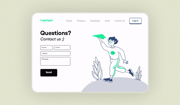
3 Fun and Effective Landing Page Examples You Can Build Yourself
Coming up with an engaging and effective landing page isn't always easy. So to get your creative mind churning, here are three examples to give you inspiration when building your own.

Designing landing page forms is a crucial aspect of creating an effective landing page that converts visitors into leads or customers.
These forms act as the bridge between your website's content and the user's action, making it essential to design them thoughtfully.
From choosing the right type of form to optimizing its layout, every element plays a vital role in enhancing the user experience and driving conversions.
This guide will explore how to create landing page forms and their various types, provide practical design tips, and share examples of well-crafted forms.
Let's start by understanding what kind of conversion you should aim for while designing landing page forms.
The goal of any landing page is to guide your visitor towards completing a specific action. Everything on the page should be designed to drive that conversion.
For instance, your landing page form might aim to:
🔸 Grow your mailing list
🔸 Drive sales
🔸 Sign up attendees for a webinar
Each of these goals requires a different type of form.
Before you dive into designing your landing page form, it’s important to identify the type of conversion you’re targeting. Generally, conversions fall into two categories:

This occurs when a customer is ready to make a purchase or book an appointment. Forms for primary conversions can be longer because the customer is already committed or very close to making a decision.
This happens earlier in the customer journey when they are still exploring their options. Forms for secondary conversions, like newsletter signups, should be shorter to capture interest without demanding too much effort.
Understanding these distinctions will help you design effective forms that cater to your audience’s readiness to convert.
Unlayer's Form tool is an integrated feature in our page builder that allows you to create and add forms to your landing pages effortlessly.
Whether you're capturing leads, signing up users, or providing a contact option, our Form tool has you covered.
This is how you can get started:
The Form tool is enabled by default, but you can easily disable it if needed. Simply use the following JavaScript code:

You can also set a limit on how many times the Form tool can be used in a single design. Here’s how:

The Form tool comes with a set of default values that you can customize to fit your needs. Here are the defaults:
Property | Default Value |
fields | [ { "name": "email", "type": "email", "label": "Email", "placeholder_text": "Enter email here", "show_label": true, "required": true } ] |
formWidth | 100% |
fieldBorder | { borderTopWidth: '1px', borderTopStyle: 'solid', borderTopColor: '#CCC', borderLeftWidth: '1px', borderLeftStyle: 'solid', borderLeftColor: '#CCC', borderRightWidth: '1px', borderRightStyle: 'solid', borderRightColor: '#CCC', borderBottomWidth: '1px', borderBottomStyle: 'solid', borderBottomColor: '#CCC', } |
fieldBorderRadius | 0px |
fieldPadding | 10px |
fieldBackgroundColor | #FFFFFF |
fieldColor | #000000 |
fieldFontSize | 12px |
formAlign | center |
fieldDistance | 10px |
labelFontSize | 14px |
labelColor | #444 |
labelAlign | left |
labelPadding | 0px 0px 3px |
buttonText | Submit |
buttonColors | { color: '#FFF', backgroundColor: '#3AAEE0', hoverColor: '#FFF', hoverBackgroundColor: '#3AAEE0' } |
buttonAlign | center |
buttonWidth | 50% |
buttonFontSize | 14px |
buttonBorder | {} |
buttonPadding | 10px |
buttonMargin | 5px 0px 0px |
Now, let’s discuss a few examples of how these default values actually work. And if you’re interested in reading more about this, you can do so here.
By default, the form includes only an Email field. Now, what does that mean?
This means that the form you add to your landing page will initially only capture the email addresses of the customers who fill it out.
However, you can easily add more fields to collect additional information using this code:

After adding your custom fields, your landing page form will look something like this:

Source: Wistia
Similarly, you can customize other fields of the landing page forms according to your needs, like:
🔹 Adjusting Form Width
🔹 Styling Field Borders
🔹 Setting Field Border Radius
🔹 Configuring Field Padding
It lets you control where your form submits its data with predefined actions:

You can also allow end-users to add a custom URL for form submission. To enable this, you can set allowCustomUrl to true.

This will look something like this in the editor:

All these codes might seem overwhelming. So, let's simplify things. We'll explain how to use Unlayer's drag-and-drop editor to easily add a 'form' to your canvas and create landing page forms without any hassle.
Let’s have a look at the Unlayer’s landing page editor.

It's super simple to get started. Just drag and drop the ‘form’ element from the sidebar, and you’re all set.
To clarify things further, we’ve created a Loom video that walks you through the process step-by-step. Check it out and see how easy it is to create stunning forms in no time.
There are three types of landing page form layouts that you can use to boost your website conversions.
It is one of the most straightforward types of form, often used for simplicity and ease of use. It guides users down a clear path with a vertical layout, making it ideal for mobile responsiveness.
This form is perfect for quick signups or contact information collection. Here’s an example of this form in action.

A double-column form splits the fields into two columns, which can make the form appear shorter and less intimidating to fill out.
This layout is best suited for desktop users and is commonly used for more detailed forms, such as registration forms or applications.

The hybrid form combines elements of both single and double-column forms. It strategically places certain fields side-by-side while keeping others in a single column to balance visual appeal and readability.
This form is great for collecting more complex data. It offers a clean and organized structure without overwhelming the user.

Let's dive into the essential tips you need to create high-converting landing page forms, complete with real-life examples to guide you.
Limit your form to the most necessary fields to reduce friction. Why? Because each additional field is a potential point of friction that might deter someone from completing your form.
So, stick to the basics to keep the process smooth.
For instance, instead of asking for detailed contact information, you can start with just the name and email address of your potential lead.
You can gradually collect more data over multiple interactions rather than overwhelming your users with a lengthy form.
Here’s an example to make things even clearer for you.

Source: Geckoboard
Now that we've covered asking for just the essential information from your customers let's focus on how your form should look on your landing page.
Even with a few fields, your landing page form must be visually appealing. Don’t just pack those fields tightly together. Give your form some breathing room.
This not only makes it look nicer but also less intimidating for users. An uncluttered form is more inviting and can lead to higher conversion rates.
Make your forms straightforward and easy to understand. Avoid jargon and complex questions, as they can overwhelm your visitors. The simpler your form, the more likely they are to fill it out.
Here are some examples of what to steer clear of:
❌ Please provide your SMTP server address.
✅ Enter your email server address.
❌ What is your preferred SaaS solution?
✅ What type of software do you use?
❌ Kindly elucidate your organizational hierarchy.
✅ Describe your team structure.
❌ Can you specify your quarterly revenue and also list your main revenue streams?
✅ What's your quarterly revenue?
❌ Describe your professional background.
✅ What’s your job title?" or simply “Job title.
❌ List all the software tools you use for project management.
✅ What project management tool do you use?
Clear labels are key to making your landing page forms user-friendly. Be specific and simple, provide context when needed, align labels close to their fields, use helpful placeholder text, and maintain consistency throughout the form.
This will ensure that users understand exactly what information is required, making them more likely to complete the form accurately and efficiently.
Now, let’s break down these terms—align labels and placeholder text—with examples to make them easier to understand.
🟠 Instead of using a vague label like "Name," use "First Name" and "Last Name."
🟠 If the field is unclear, add a short explanation. For example, for a field labeled "Phone," you could add "Include area code" as a sub-label.
🟠 Make sure labels are placed right next to their respective fields to avoid confusion. For instance, place the label "Email Address" directly above or beside the email input field.
🟠 Placeholder text inside the field can guide users on what to enter. As for an email field, use "e.g., name@example.com" as the placeholder text.

Source: Unlayer
Bonus point: By asking only for vital information, keeping your landing page forms simple, and using clear labels, you can create user-friendly forms that significantly boost your chances of getting more conversions and happier customers.
Creating a strong CTA for your landing page forms is like giving your customers a gentle nudge toward completing their journey with you.
Let’s break it down into a few easy steps, along with some examples to make it all clear.
First and foremost, clarity is key. Your CTA should leave no doubt about what will happen when someone clicks it. Avoid vague terms like "Submit" or "Click Here." Instead, be specific and action-oriented. For example, if you’re offering a free eBook, a good CTA would be:
🔸 Get Your Free eBook Now
🔸 Download My Free Guide
Your CTA should also highlight the benefit your customer will receive. This reinforces their desire and makes it clear why they should take action. Let’s say you’re running a free trial for a SaaS product. Your CTA could be:
🔹 Start Your Free Trial Today
🔹 Try It Free for 30 Days

Source: Hubspot
Adding a sense of urgency can encourage immediate action. Limited-time offers, or words that suggest immediate benefits work well here. For instance, if you’re promoting a limited-time discount, you might use:
🔸 Claim Your Discount Before It’s Gone
🔸 Get 20% Off Now
Powerful, persuasive words can make a huge difference. Words like "exclusive," "now," "instant," and "limited" can create a stronger pull. For a webinar signup, you might write:
🔹 Reserve Your Spot Now
🔹 Join the Webinar Instantly
While it’s important to be persuasive, don’t overcomplicate your CTA. It should be short and to the point. For instance, if you’re offering a newsletter signup, a concise and effective CTA could be:
🔸 Join Our Newsletter
🔸 Sign Up for Updates
One of the easiest ways to keep your forms on brand is by using your brand colors. Make sure the form fields, buttons, and even the background align with your brand's color scheme.
For example, if your company is called "BlueWave," and your primary color is a deep ocean blue, your form button could say "Get Started" in white text on a deep blue background.
Here’s a real-life example of how to use brand colors in your landing page forms.

Source: Rippling
Similarly, use the same fonts in your forms as on your website and other marketing materials. Don’t forget to include your logo somewhere on the form. It could be at the top, the bottom, or even subtly in the background.
Let's talk about why adding visuals to your landing page is a game-changer. A landing page that's just a wall of text and form fields isn't going to grab anyone's attention.
But throw in some eye-catching visuals, and suddenly, you can get an engaging page that draws people in.
Look at Charity: Water, for instance. This clever use of imagery not only captures attention but also directs users to where you want them to go.
You can do the same with your landing pages. Choose visuals that match your brand and message, making your page more appealing.

Source: Charity: Water
Most people use mobile devices to access your landing pages. If your form is mobile-friendly, you can avoid losing those leads and having them return to the search results.
To keep them from bouncing, make sure your landing pages use responsive design. This way, your site adapts to any device your audience uses, giving them the best experience and keeping them engaged.
One effective strategy is to use single-column forms. They are less cluttered and easily adapt to any screen size. You can also use tools like Unlayer to create responsive landing page form designs.
If users don't see a clear incentive, they're not going to fill out your form. That's where a creative landing page copy comes in. A compelling and imaginative copy paired with a strong incentive in your form can help persuade visitors to take action and fill it out.
Have a look at the following example for a better understanding.

Source: Hulu
Following the previous tips is great, but without relying on solid data, you won't know for sure what works best.
Remember, assumptions can lead you astray. That's why A/B testing every aspect of your landing page forms is essential before finalizing the design.
Here are some tips on how to A/B test your forms:
Try shorter forms versus longer ones. For instance, you might test a form that only asks for a name and email against one that asks for additional information like a phone number and company name.
Try different call-to-action (CTA) buttons. For example, test variations like "Get Started Now" versus "Sign Up Today" to see which one gets more clicks.
Test different ways of labeling your form fields. For example, compare "First Name" to just "Name" and see which users prefer.
Test single-column forms against multi-column ones to see which layout is more user-friendly.
Test different color schemes for your form and CTA buttons. For example, a red button versus a green button might impact conversion rates differently.
By A/B testing these elements, you can use data to guide your decisions and ensure your landing page forms are optimized for the best user experience and highest conversions.
To wrap things up, designing landing page forms doesn’t have to be daunting. By understanding the different types, implementing practical tips, and drawing inspiration from real-life examples, you can create forms (using Unlayer 🤭) that not only look great but also convert.
Remember, a well-designed form is all about balancing aesthetics with functionality. So go ahead, apply these insights, and watch your landing page performance soar.
Insights on email design, content creation, and developer productivity.
Coming up with an engaging and effective landing page isn't always easy. So to get your creative mind churning, here are three examples to give you inspiration when building your own.

Avoid a crash landing! Discover common mistakes in landing page templates and learn how to create high-converting landing page designs with ease.