Would you buy your favorite brownies but packaged in a ziplock bag? Obviously not. It’ll ruin the crust and will get your hands messy.
Similarly, incorrect banner sizes will fail to showcase your email content, no matter how valuable. If the banner is too long, doesn’t load, or looks plain awful, it’ll repel your audience - just like you rejected the brownies because of their improper packaging.
In this article, we answer the long-prevailing question of the ideal email banner size along with a few best-kept email banner tips and tricks.
What Is an Email Banner and Why Does Its Size Matter?
An email banner is a visual element that features your value proposition, call to action, brand logo, and whatnot. It is what sets you apart in your audience’s inbox clutter.
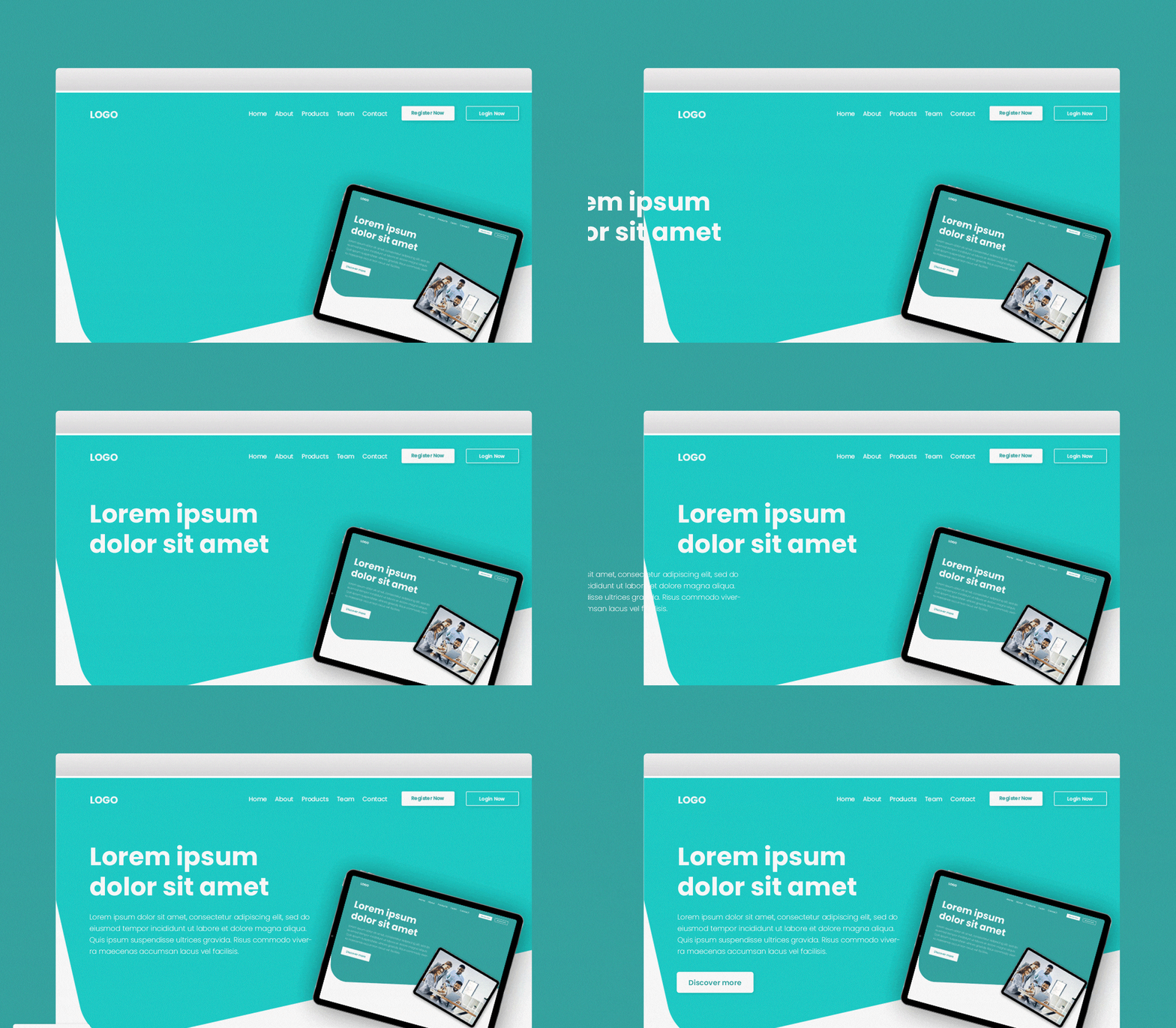
Consider the following image. Which grabs your attention more?

Including banners within an email is a proven way of increasing engagement, as it has a click-through rate of up to 10%. However, incorrect banner sizes will spoil all the hard work you put in.
If an improper email banner size is chosen;
The email will appear distorted to the end reader
Your client’s email provider will turn on the horizontal scroll bar if the banner is too wide
Mobile users will have a hard time making sense of your message
Note: If you’re looking to find leads more effectively, pairing a compelling banner with the right outreach tools can make all the difference.
Myths of Email Banner Size Debunked
Just like email design, email banner size has evolved over the years. What once was considered accurate is now a tale of the past.
We expose the commonly believed myths revolving around email banner size.

1. The golden 600px rule
Let’s go back to the time when Microsoft Outlook ruled the email world. Most computer monitors were 1024px at the time, which restricted marketers from designing banners no longer wider than 600px. Alas, the golden 600px rule was born.
Marketers today still follow this rule religiously, but times have changed. The most common desktop screen resolution as of April 2021 is 1920x1080px. This proves that marketers can go beyond 600px in width when designing emails. Interestingly, some swear by sending full-width emails for an instant wow factor, which can be achieved through computers for graphic design.
Back in the day, emails were mainly opened on computer screens. However, 46% of all emails are now opened on mobile devices. This calls for different email banner dimensions when designing for mobiles.
2. Disappearing background colors
Disappearing background colors sound more like a magic trick than an email design norm.
It’s believed that popular email service providers, like Gmail and Outlook, don’t show background colors of banners exceeding 640px. However, that’s not the case. Many marketers have designed emails up to 800px only to find them displaying perfectly well on different email clients.
3. Height doesn’t matter
Email marketers believe that as long as the width is under check, how long a banner is doesn’t matter. Let’s pop the bubble - the height of an email banner is as important as its width.
The average length of an email ranges between 1500px to 2000px. Email banners shouldn’t exceed this range, or else you’ll have annoyed readers waiting for the email to end. We suggest the following recommended heights for different banner types, discussed in the section below.
Ideal Sizes for Different Email Banner Types
Email banners come in all shapes and sizes. They are placed differently within an email and have specific purposes to meet.

We’ll be discussing the ideal sizes for email headers, body banners, and footers.
1. Email Header Size
The header is the first thing your audience sees once they open an email. It usually features a vibrant yet relevant background image, brand’s logo, call to action buttons, and the main heading, explaining the gist of the email. If not attention-grabbing, the prospect will seldom continue reading the email.
When it comes to email headers, for desktop screens we recommend a width between 650px to 700px and a height between 90px to 200px. For mobile screens, an ideal email header image size is 350px in width and up to 100px in height.

Email header size comparison for desktop (D) & mobile (M)
Many design-savvy marketers are sending emails with full-width headers. You can surely jump on the bandwagon, but we recommend testing how the emails appear on your audience’s preferred email clients before sending them.
2. Email Body Banner Size
As the name implies, this banner type is simply one that appears within an email’s body.
Instead of writing a paragraph (or two) narrating your inspiration behind a product line or asking for a review, why not convey your message through an attractive banner? While you may use as many banners as your heart desires, we recommend sticking to one.

Email body banner size comparison for desktop (D) & mobile (M)
The ideal size for email body banner for desktop screens is 650px to 700px (width) and 350px to 500px (height). For mobile screens, the suggested size is 350px (width) and 200px (height).
3. Email Footer Size
Often referred to as email signatures, the footer can be found at the bottom of an email. It usually features a company’s contact information, important links, coupon codes, social media handles, and the unsubscribe button.
47.3% of all emails are spam. Footers are essential for saving your email from entering the much-dreaded folder. It complies with anti-spam laws by mentioning your company’s postal address, contact information and providing a link to unsubscribe.

Email footer size comparison for desktop (D) & mobile (M)
When it comes to email footers, the recommended size for desktop screens varies between 650px to 700px (width) and up to 150px (height). For mobile screens, it is suggested to follow 350px (width) and 100px (height).
The ideal sizes for different banners have been uncovered. The default width for Unlayer templates is 600px and can be increased to 900px - giving you the best of both worlds. Refer to the following useful table the next time you design email banners.

Tips and Tricks for Impactful Email Banners
Email banners are a game-changer; we know that. But there’s more to designing impactful banners than just following the recommended sizes. Follow the below tips and tricks for creating email banners that stand out.
Characters Per Line
To ensure banners don’t look too wordy, the text’s length should be tracked. We recommend staying between 45-75 characters per line. This works both for desktop and mobile screens, so you don’t have to worry about making multiple banners.
Email and Banner File Size
The heavier the email is, the more likely your audience’s email provider will clip it and send it to the spam folder. The email size should not exceed 100kb, while the banner size should not be more than 40kb each.

For banner images, consider using an image compressor tool. All images should be saved in PNG format. The latter maintains high quality without affecting the resolution once compressed.
Banner Content
There’s so much you can do with a banner’s visual and textual content. Feature a vibrant background image, include call to action buttons, and flex your Google reviews - the ball is in your court.
Just ensure harmony in design is created. The text should not be placed over a patterned background, all colors should go together, links should be displayed as buttons, and the design should not be cluttered.
We suggest choosing a design from Unlayer’s ready-to-made 2400+ templates. All templates are visually appealing and mobile responsive. The easy-to-use drag and drop editor lets you modify templates as per your brand requirements.
Why make an effort when you can rely upon Unlayer’s beautiful-looking designs?
Email-safe Fonts
Fonts that are hosted on a web server provide great opportunities to be creative. However, there’s always a concern that an email client might not support it. We suggest sticking to email-safe fonts, so your message appears the way intended.
Prior Testing
We recommend testing emails prior to sending, especially for banners of full-width or width exceeding 700px. Figure out the email service provider that your audience mainly uses and send a test mail. This is a small step for ensuring banners and emails look great to the final reader.
5 Email Banner Design Examples to Inspire You
Here are some examples of attention-grabbing email banners:
1. Hootsuite

The creative tagline, bold fonts, and vibrant colors make this one of my favorite email banners. The CTA is pretty loud, doing its job perfectly—encouraging the reader to click. Isn’t it?
2. Uber Eats

What a straightforward email banner it is—communicating the deal well without overwhelming us with the details. The color choice and imagery make this banner impossible to ignore. What do you think?
3. Polaroid

This is actually what a cool email banner looks like. The headline is super catchy and what truly stands out in this banner is the overall effect—bold and so appealing.
4. Shopify

What we like about this banner is the gradient color and the playful visual elements. The headline and tagline are spot-on and the CTA is inviting without being pushy.
5. NFL Sunday Ticket

The banner is self-explanatory even if you skip reading the full email. The fonts, the colors, the logo, and the deal— everything is on point, urging the new subscribers to buy the ticket ASAP.
Wrapping it Up
Email banners promise your audience’s attention and engagement. However, incorrect sizes will spoil all the hard work you’ve put in. Follow our recommended email banner sizes for both desktop and mobile screens for making impressive email banners that display well.
![What’s the Ideal Email Banner Size? [+Design Tips & Examples]](https://images.ctfassets.net/eut50lk49cau/lLhTY8hEzVxPaxHZ8OleN/35d1b824ac8ec299a54548d7b231270d/email-banner-size.png)


