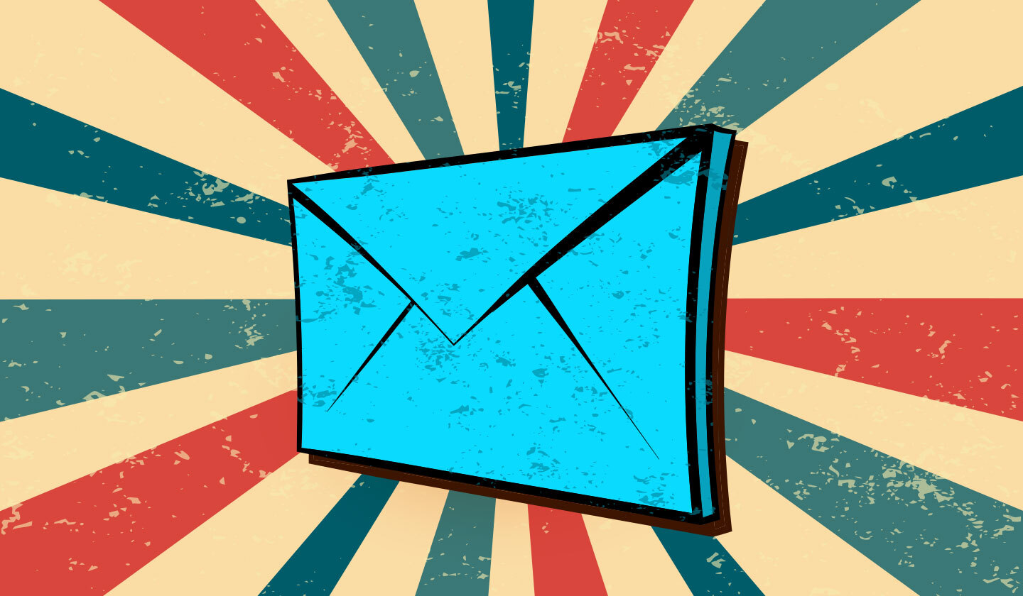
Reasons Why Retro Designs in Email Are a Total Hit ❤️🔥
You know what’s cool in the email world these days? Retro designs. Read here to learn tips for creating awesome and impressive retro designs in emails.
More than 361 billion emails were sent in 2024 alone. Imagine standing out from that!

Email marketing is and will always be an integral part of any company’s marketing strategy. But just sending emails doesn’t guarantee success. To convert leads, emails need to be impeccably designed.
Clueless about email design? No worries! This guide discusses 13 email design best practices along with email design dos and don’ts at the end. Let’s get started.
Email design plays a crucial role in the success of your email marketing campaigns. Here's why it's so important:
The design of your email is the first thing recipients see when they open it. A visually appealing and well-organized layout can make a strong positive impression, increasing the likelihood that recipients will engage with your content.
Consistent and thoughtful design elements, such as color schemes, fonts, and logos, help reinforce your brand's image and identity. This consistency in email marketing, in turn, builds brand recognition and trust with your target audience.
Ultimately, the goal of your email marketing campaigns is to convert recipients into customers or leads. A well-designed email that effectively communicates your message and value proposition can drive higher conversion rates.
You don’t need to be a skilled email marketer to design impactful emails. By following the below discussed email design best practices, you can become your audience’s favorite email sender.

Often ignored, the sender’s name is a critical element of any email design. In fact, 68% of Americans decide whether or not to open an email simply by reading who sent it.
Why is it so important? Well, the sender’s name adds credibility to the email and makes the reader curious enough to open it. There’s no one-size-fits-all approach to picking the right sender name. However, make sure to keep it personal, relevant, and short.
One rookie mistake when sending emails is to send by your staff’s name solely. When readers don’t remember a name, they are likely to move the email to the spam folder. One can include their staff’s name only when combined with the company’s name for instant recall.
The following image shows which sender names to consider and which to let go of.

People read subject lines to filter out irrelevant emails. A well-written email subject line is a fool-proof way of grabbing your customers’ attention.
Follow the below guidelines the next time you write an email’s subject:
The ideal subject line length depends on several factors, but a good rule of thumb is to keep it between 30 and 50 characters or around 4 to 7 words (including the emojis). Be sure not to add unnecessary words—each word included should have a purpose to fulfill.
If you can awaken someone’s curiosity, let alone add value, you’ll improve the chances of them opening your email. Try creating suspense that can only be satisfied by opening the email.
Subject lines can be fun and still be honest without coming off as gimmicky. If you’re true to what you propos in the subject line, the better your chances of establishing trust.
Why write a phrase when you can explain it with an emoji? Including emojis in your subject lines is an excellent way to stand out from the inbox clutter. Not only do they look good, but they ultimately work in your favor. According to a study, adding emojis increased open rates by 1,071% on Android and 662% on iOS devices.
The following image highlights the 15 most used emojis in subject lines.

Without a good preheader or preview text, readers may not get the full scope of what you’re trying to say. The preheader acts as an extension to your subject line. Hence, it should explain the value proposition further and convince people to open the email.
Not more than 70 characters and not less than 30 characters
Personalize it just like you would other email elements
Don’t repeat the subject line, but make it relevant to it
It should add value, interest, or context
Make sure the length is responsive to mobile devices
Would you buy a product if it’s not packaged properly? Obviously not.
The header of an email acts as the product packaging. It’s the first thing your readers see when they open the email - better make it worth their time.
If the header is not appealing and meaningful, then you’ve lost yourself a customer. It can either be completely text-based or image-based. We recommend merging the two to create perfect harmony between them.
The headline should be catchy but should also tease the reader of what’s to come ahead. The image included should be relevant to the email message. Any important links can be incorporated in the form of buttons to encourage your reader to take action early on.
Any descriptions following the headline should summarize the main gist of the email. This not only adds clarity but convinces the prospect to continue reading.
The following header from a dental facility’s email is the perfect example of how it should be.

Writing copy for emails is an art in itself. No matter how important visual content becomes, readers still prefer reading the message you have to communicate.
The general rule of thumb is not to exceed 200 words - this includes the header. Your message should be concise and spoken in a way that attracts your reader. Using Gen Z slang when your readers are aged 50+ is a recipe for disaster.
The font of the email’s copy decides the fate of the latter’s success. You can be tempted to use fancy web fonts to display your brand’s message. But what if it fails to load when sent to your prospects? Unfortunate, right?
It is necessary to use email-friendly fonts that display on all screens. While we suggest using system fonts, web fonts can be applied only if a fallback font is put in place.
One should remember the following email design best practices concerning fonts:
Simple, on-brand, and easy to read
Maximum of two fonts throughout the email
Sans serif fonts in body text for readability
14pt to 16pt for body copy and 22pt to 24pt for headers

It’s safe to say that images are one of the most important elements when it comes to designing emails. Interestingly, 65% of readers prefer emails that contain images.
Images are eye-catching, present more information than words, and generally stick with people long after the words have faded away. But using them poorly will leave everyone who sees them with a bad taste in their mouth.
Consider the following tried and tested strategies when choosing which pictures to include.

Large, high-resolution photos take longer to load, and load times directly influence audience patience. Keep them engaged by choosing images that have a high resolution, in PNG format, and under 1MB in size.
Plus, spammers often use images with large file sizes. So, choosing the correct image format can also help maintain your email's deliverability and reduce loading times, both of which are crucial for keeping your email subscribers engaged.
Don’t add images for the sake of adding them. Each picture included must have a strategic purpose behind it. If it doesn’t add value, better to let it go.
Creating and using original images is ideal when getting your branding and messaging across the way you want them to. But if you have to use stock images, make sure your competition isn’t using the same ones or something too similar.
If you put words over an image, make sure you’re not choosing a picture that’s overly patterned, complex or doesn’t feature a contrasting color to the text itself. Failing to do so will make the words harder to read and may discourage readers from digging deeper into the email.
If you have to implement one point from this entire article, we suggest adding alt text to the images included.
A great percentage of people have their images turned off. Without alt texts, they wouldn’t know what you’re talking about and, hence, will result in them clicking on the unsubscribe button. Alt texts also add credibility to an email when it is being sent for the first time.
The overall color palette of an email plays a crucial part in how it is perceived. If harmonious colors are not chosen, then your emails will be nothing less than an eyesore.
Fortunately, playing with colors is no rocket science and can be done without hiring a professional. Keep the following guidelines in mind:
Define a palette of your brand’s colors and stick to them. You can include other colors, but the main focus should be on the defined palette.
Highlight sections using a contrasting color than the background color.
Do not go overboard with using multiple colors in an email. Remember, you’re aiming for a powerful email, not a rainbow sundae. Three colors are more than enough.
The background and text colors should mix well. Having a white background with red-colored text just looks plain awful.

Related: Influence of Colors in Email Marketing: A Complete Guide
Call To Action (CTA) is hugely important to email campaigns and email design in general. By including a single CTA, you can witness an increase in clicks because emails with less than three CTAs have higher click-through rates.
CTAs don’t have to be fancy; they just need to work. The below best practices ensure you create an enticing CTA each time.
Keep CTA text short, meaningful, and action-oriented.
Try to keep CTAs above the fold.
Use appropriate size and color to help CTAs stand out without being distracting.
Limit usage to one CTA per email, two at the absolute most, to limit compromising the desired action.
Keep CTAs aligned with the subject of the email.
The following image compares great calls to action against average ones.

An email’s footer is as important as its other elements. Readers often look at the footer for actionable information, like contact details and social media profiles. It should also include a link or a button to unsubscribe from receiving future emails.
The footer is commonly overlooked by email marketers, which presents an opportunity to generate maximum utility from it. Get creative with them and consider including the following suggestions:
Unique selling proposition
Core brand values
Company slogan
Store location
Coupon code
If you haven’t been living under a rock, you probably realize the significance of personalizing emails. In today’s world of hyper-customization, customers expect to receive messages targeted explicitly for them.
Personalizing emails is not hard. You just need to include two elements: merge tags and dynamic content.
Merge tags are a specific code that integrates your audience’s data from the mailing list into emails. With merge tags, you can acknowledge the reader with his/her first name, second name, username, or nickname. Through this, the email reader perceives as though having a one-on-one conversation with a brand. You can greet the reader in the email’s body and in the subject line, preheader, and header sections.
The following email uses merge tags to include each customer’s email address.

Simply defined, dynamic content refers to personalizing the entire content section for each reader to make the campaign more meaningful for them. A common example is displaying gender-specific products, like clothing, skincare, and perfumes, to the right gender.
Another way to use dynamic content is by giving yearly overviews of a customer’s interaction with your brand. In the below example, Spotify sent personalized emails to each customer, informing them about their total listening minutes.
The following examples show content can be personalized in emails.

Related: How to Create a Dynamic Email Template With Unlayer?
Throwing all the discussed email design best practices together doesn’t guarantee an impactful email that engages and converts. Just like with anything, a balance needs to be created. If not, then your reader will be left confused and, worse, frustrated.
Avoid these unfavorable emotions by focusing on the text-to-image ratio, white balance, and spatial balance.
Related: Email Layout vs. Email Structure: What’s the Difference?
Bombarding emails with too much text or images will simply look unappealing to the eye. We recommend following the 60/40 rule when designing emails - 60% text and 40% images. This formula works for most companies along with spam filters, as they are less likely to move the email to the much-dreaded folder.
Related: HTML Vs. Plain Text Email: What Works Better?
Have you ever gone perfume shopping? The salesperson hands you over a jar of coffee beans between different scents to freshen up your smelling sense. The same logic applies to emails.
Creating white or negative space is of extreme importance. Having a proper amount of negative space reduces eye fatigue, improves readability, provides a cleaner look, and allows other elements to shine.
Many email marketers use spatial balance to properly display important elements, from images to body copy to CTAs and more. The three most common layouts are the one-column, the inverted pyramid, and the zig-zag—all of which we’ve discussed in detail here for better reference. Each has its pros and cons, so you’ll have to figure out which best supports you.

According to research, 46% of all emails are opened on mobile devices. Emails must be designed to work well on all mobile devices, or else you risk losing email subscribers.
It’s not tricky to create mobile responsive designs; just follow along with the below guidelines.
If a template is used to design emails, make sure it’s mobile responsive
Text and images should shrink in size to adapt to the mobile device being used
CTA buttons should be large enough so that they can be clicked on with a thumb
There should be adequate white space between different elements to make reading easier
Landing pages should also be mobile-friendly
You might think an email design is great, but your readers may disagree. The truth is you never know how your audience will perceive a certain email. Hence, the performance of emails should be monitored through A/B testing.

You don’t need to be an experienced email marketer to perform A/B testing. Just follow the easy steps below:
Create two email designs with differing elements, such as a CTA, color palette, and video. We recommend testing a single variable at a time.
Send the first email to one half of your audience and the second to the other half.
Measure which email gives the desired results
Continue testing for other variables
Here are some additional tweaks to consider to make your emails stand out.
A little movement goes a long way in grabbing attention! Consider using GIFs or subtle animations to make your emails stand out in crowded inboxes. Even a small flicker—like a flashing discount—can keep readers engaged just a bit longer.
Related: Gamification Email Marketing: The Fun Way to Boost Revenue
Not everyone views emails the same way—some prefer light mode, while others stick to dark mode for checking their email inboxes. Therefore, it is pertinent to keep that in mind and optimize your email design for both to ensure a seamless experience no matter how your email is viewed.
Email design best practices will seldom work if a powerful design tool is not used. Unlayer is our preferred choice since it lets you make beautiful-looking emails without needing any design or coding skills. So relax in the back seat and let Unlayer take control of the wheel.
With the user-friendly drag and drop editor, you can play around with different designs. Add text, images, buttons, and other elements to make your version of a masterpiece. Save custom tools and custom blocks for future use.
Why design from scratch when you can conveniently choose from Unlayer’s 2,400+ email templates? Choose templates by industry or campaign nature - there’s something in store for everyone. All templates are mobile responsive and display well on all internet browsers.
Personalize emails and newsletters by adding merge tags
Get instant feedback on design through the collaborative feature
Export to your preferred email service provider
Designing visually appealing and results-driven email designs is hard, but it doesn't have to be. Here are some do's and don'ts for creating emails that please your users.
All emails feature 60% text and 40% visual content
A maximum of two CTAs are used per email and are kept short and relevant
All email design elements are mobile responsive
Easy-to-read fonts are used in all emails designed
Emails are either text-heavy or filled with too many images
Multiple CTAs are used within an email
All email elements are kept the same when designing emails
Too many fonts are used within an email
![Email design do's and dont's [infographic]](/_next/image?url=https%3A%2F%2Fimages.ctfassets.net%2Feut50lk49cau%2F2KJUIgqRAz1p2SWFAt0C35%2F9bd519e00cc64f6b0780f54aa4e9b880%2F60a4fa56b93bd6397915bb91_QMaJAmqShD_chk_-ks5EKzz6XXgpWErIrZPzX7htdheREF7wDqNEJ80iMC4TI21BJBuFnmjGwfns5jcua9fweNx7CvtdGI3xrkU.png&w=1920&q=75 "Email design do's and dont's [infographic]")
The truth is that your audience’s inboxes are flooded with emails from brands fighting to win their attention. Take the easy way out and instantly awaken their curiosity by following the above-discussed email design best practices.
Insights on email design, content creation, and developer productivity.
You know what’s cool in the email world these days? Retro designs. Read here to learn tips for creating awesome and impressive retro designs in emails.
Want to design customizable emails and landing pages for your target audience? Then Unlayer is the tool you’re looking for. Read this blog to know why.

Clueless about email infographics? This easy-to-follow guide shares everything you need to know about adding infographics to emails. You’ll be a pro in no time.