They may look the same, but trust me, there’s a huge difference.
No, we’re not talking about Cilantro and Coriander; we’re talking about landing pages and homepages.
Surprisingly, many marketers I've talked to confuse landing pages with homepages, which can cause hefty damage to your business’s ROI and marketing efforts. And we’re here, as your knight in shining armor, to help you identify the difference between landing pages vs. homepages.
Navigating the differences between a landing page and a homepage will enable you to direct customers to the right source and boost conversion rates through both these web pages.
So, let’s start digging into the differences.
How Is a Homepage Different From a Landing Page?
The purpose, structure, target audience, everything about these two differ. And we’ve discussed these differences in detail below.
So, next time when someone at work uses these two terms interchangeably, feel free to flex a little and correct them with an “Oh, you mean . . . “ 😉
Let’s start by discussing the homepage.
Homepage
A home page is like your website's central hub or main menu. It is designed to introduce customers to your brand and help them become more aware of your business.
In other words, a homepage is the main page that collects all your website's information, such as features, value propositions, and capabilities, to let your readers know anything and everything about your business.
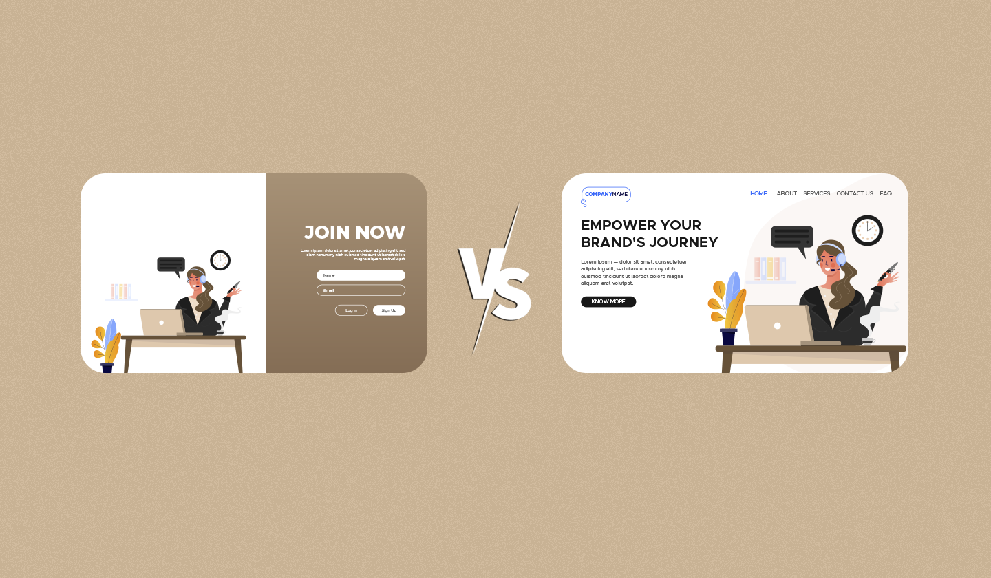
Unlike a landing page, the design of a homepage includes a navigation bar, a brand-centric theme, and multiple external and internal links. It is accessed by people from all the customer journey stages.
Landing page
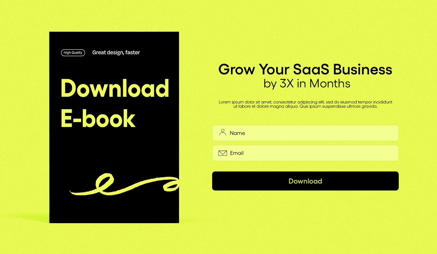
A landing page is a single or stand-alone web page that is created for a specific purpose or campaign, such as booking a demo, signing up for a product or service, etc.
The ultimate goal of a landing page is conversion. And the source of traffic can be paid ads, emails, or specific channels. Each landing page is designed for customers of a specific journey stage.
Unlike a homepage, a landing page design includes a tailored copy, a single CTA, no navigation bar, and a campaign-centric theme.
The table below can help you understand the differences between the two much better:
Homepage | Landing Page | |
Target Audience | Users of all customer stages | Users of a specific customer stage |
Goal | Create brand awareness | Conversion |
Navigation bar | Yes | No |
No. of CTAs | More than one | One |
Links | Multiple | One |
Design centered around | Brand | Campaign/purpose |
At times, the duration of a homepage and a landing page also differ. Where homepages last on a website for way longer, a landing page may last for as long as a certain campaign or promotion exists. Plus, you can have many landing pages per website but only one homepage.
Comparing the Anatomy of Landing Page Vs. Homepage
We humans are visual creatures. So, to help you understand how these similar-looking web pages are quite different, here are some examples to demonstrate their anatomy.
⚫ Homepage

⚫ Landing Page

Notice how the homepage is longer than the landing page and has much more design elements and text to educate the audience about the product.
On the other hand, a landing page is much shorter, has no distracting elements, and revolves around a single message.
Now that you’re aware of the difference, doesn’t it sound too wrong to use the terms homepage and landing page interchangeably? We’re sure you’re nodding a yes.
And since we’ve discussed the difference between a homepage and a landing page, let’s dive in and unveil the right way to make each.
How to Create The Perfect Homepage for Your Brand
Creating a page with everything your business offers, has accomplished, or helps your audience achieve may feel like a daunting task. But if you strategize the design while keeping your target audience and goal in mind, it’s all simple and easy.
Here’s a list of elements that you should and should not add to your homepage
Dos
🚀 Overview of all your website content
Your homepage summarizes what you do and what you’re offering to your customers. So, try to mention the following things on your homepage.
Who are you as a brand
What services do you offer
What problem do you solve
Your unique offering
Remember, the goal of your homepage is to make your customers aware of your brand. So, try to create an impressive, lasting, and convincing impression through your brand overview.
🚀 Brand-centric theme
Since your homepage is like an introduction to your brand, the design should say so, too.
Try to create a homepage that follows your brand guidelines by using distinctive brand colors, tone of voice, fonts, type of imagery, etc. This helps you create a unique business identity and reinforce your brand’s image among your readers.
We really adore how Lavender incorporated their brand guidelines on their homepage. Feel free to be inspired by their design.

🚀 Social proof
Did you know that 88% of customers trust customer reviews?
You must include social proof on your homepage to increase the likelihood of your customers purchasing from your brand. You can do this by adding customer testimonials, links to your case studies, influencer endorsements, certification, etc.
You’d be surprised how easily social proof influences a buyer’s decision.
🚀 Navigation bar
So much about your brand that you’d want to tell your customers, but such little room on the homepage for it! Right?
Enter navigations.
A navigation bar allows users to explore different pages on your website. You can easily include links to all your assets or resources and encourage customers to know more about your brand.
When adding a navigation bar, make sure it:
Results in a pleasant user experience,
Aligns well with the design of the homepage,
Has a short, clear, and descriptive text on it.
This is everything that you MUST add to your homepage. Now, let’s talk about the element that you must avoid adding to your homepage at all costs.
Don’ts
❌ Non-responsive design
It is reported that in 2023, 96.3% of people used smartphones to access the internet.
So, it's a huge red sign if you’re not creating responsive homepages or landing pages. Some important things to consider while creating a mobile responsive and optimized homepage are:
💠 Keeping the copy short and concise
💠 Placing the CTA on the top
💠 Avoid using too many visuals
💠 Making sure the navigation bar is also clickable through mobiles.
❌ Is not SEO-friendly
Your homepage is full of keywords related to your brand, and it helps rank many of your other web pages, too.
So, you need to ensure that your homepage is SEO-friendly. Here are some ways to do so:
⭕ Choose a keyword that accurately defines your product/service.
⭕ Use high-quality backlinks or even buy backlinks in your non-branded keywords.
⭕ Write an enticing title.
⭕ Add relevant internal links (but please don’t bombard your homepage with them.)
⭕ Invest in your homepage’s technical SEO.
❌ Heavy or poor-quality media
The homepage is where you’d want to add your product/service’s introduction video and compelling images.
But be careful; don’t add too many videos and images, as that can affect the homepage’s loading speed. On the other hand, using poor-quality images and videos can affect your brand’s credibility and reputation.
❌ Cluttered copy
We understand you want to tell your visitors that your brand is different, that it is what they need, and that they can benefit from it in unique ways.
But no matter how much you want to, avoid adding too much information on your homepage, as it will only distract and confuse your visitors. You don’t want an information overload for your audience, now do you?
So, these were the do’s and don’ts of creating homepages that can win the hearts and attention of your subscribers. Now, let’s talk about how you can create conversion-worthy landing pages.
Tips To Create Stellar Landing Pages
Since the purpose of landing pages differs from the homepages, their design strategy will differ a lot, too.
Following are the elements that you should and should not add to your landing pages:
Do’s
✅ Targeted messaging
Unlike your homepage, each landing page is designed for a specific type of users. For example, a ‘book a demo’ landing page will be designed for users who are in their consideration phase.
Therefore, the copy of your landing page should be written while keeping the type of target audience in mind. Look how this demo request page from SharpSpring is personalized for customers in the consideration phase.

Related: Design Emails and Landing Pages That Speak to Target Audience.
✅ Compelling CTA
A compelling CTA is equally necessary on a homepage, but since landing pages are purpose-built for conversions, we’d like to highlight their importance here.
When creating landing pages, make sure your CTA is well-placed and well-described. According to sources, personalized CTA buttons convert 42% more. In addition, tests have shown that a red-colored CTA button converts 34% more than a green-colored one.
✅ Campaign centric design
Each landing page is designed for a specific purpose. It can promote a new feature, offer, or something that leads users down the sales funnel.
The intent of your landing page should be evident from its design and copy too. Here’s an example that might inspire you.
Look at how the design of the entire landing page speaks to the promotional sale. That’s what you should aim for, too.
Dont’s
🚩 Unclear traffic source
You must have a clear idea of the traffic sources of your landing pages because, depending on your campaign, a single landing page could fetch traffic from email, paid ads, YouTube, etc.
Identifying where the traffic comes from and what kind of visitors it is pulling enables you to create a more promising and conversion-worthy landing page strategy.
🚩 Distracting elements
Single message and single CTA.
With everything minimal, you should also ensure that there are no distracting elements on your landing pages, such as too many videos, CSS animation, or a navigation bar.
Because such elements can distract your users from conversion and divert their attention elsewhere.
So, when it comes to landing page designs, less is more.
We have talked about the dos and don’ts of these pages separately, but some design elements are an absolute must-add on both of these pages. Let’s shed some light on them.
Must-have Elements for Both Homepages and Landing Pages
No matter landing pages or homepages, you should add the following elements in both:
🔷 Visual hierarchy
Visual hierarchy is an important design element.
It improves user experience, directs the reader to conversion, and makes your content more scannable and consumable.
Some important tips for creating a visual hierarchy in designs include:
🔲 Using white space,
🔲 Opting for a Z or F pattern,
🔲 Structuring the content according to their importance (most important —> least important)
🔲 Using colors strategically
Creating a visual hierarchy not only improves user experience but also skyrockets conversions. A win-win situation for both you and your customers.
🔷 Accessibility
According to WHO, at least 2.2 billion people have a near or distant vision impairment, and 430 million people have disabling hearing loss.
So, to ensure that your website is accessible and user-friendly for people with all kinds of disabilities and impairments, you must follow the WCAG guidelines while creating your homepages or make your website ADA-compliant.
You can make your website, homepage, or landing page accessible by ensuring that your website:
Is easy to read and process for everyone,
Includes color palettes that do not create sensory overload for the audience,
Has media that does not overwhelm the viewers.
Too much information? Don’t worry. Create landing pages and homepages that boost engagement with Unlayer like a breeze!
Key Takeaway
Hope this article cleared all sorts of confusion about landing pages vs. homepages.
These differences will help you understand each webpage better and create more effective, conversion-worthy, and enticing landing pages and homepages.
If you still have any confusion or need clarification, let us know in the comment section below.
FAQs for Landing Page vs. Homepage
Wait, the learning hasn’t ended yet.
We answered some frequently asked questions about landing pages vs. homepages.
Q: What are the types of landing pages?
A: Some common types of landing pages are:
Lead generation
Educational
Squeeze pages
Long form pages
Promotional landing page
Q: When should you use a landing page or homepage?
A: Landing pages are designed for specific marketing or sales campaigns.
You need to create a landing page when you want to streamline and boost your lead generation process or when you want to promote a specific campaign or feature.
Q: Why do landing pages convert more than homepages?
A: Landing pages convert more than homepages because landing pages are primarily designed to convert, whereas homepages are created to make visitors more brand-aware.
Q. Can a landing page also be a homepage?
A. Rarely, but yes.
Small businesses often have a single page that serves the purpose of both a landing page and a homepage. However, this is a damaging approach for two reasons.
The goals of each are quite unique and can’t be accomplished through a single source.
The content overlapped will be confusing and distracting for the user. Leading to little to no conversions.


