Best Email Builder Tools in 2025: Features & Pricing Compared
Compare the best email builder tools — Unlayer, Beefree, Stripo, Topol.io, Postcards, and Chamaileon — by features and pricing, and see why Unlayer leads.


Do you want to increase your website conversions and get more leads? Popup designs are a great way to do just that.
Popups can help capture visitors' attention to your site and encourage them to take action, like signing up for your email list, newsletter, or downloading content.
But if done wrong, popups can be intrusive, annoying, and even drive away potential customers.
That’s why knowing how to create effective popup designs that will get results without driving away visitors from your site is essential.
This guide will give you an in-depth look at how these powerful design elements work and provide tips on creating effective popups to help you achieve your goals.
You’ll learn about different types of popup designs, how they should be used, what factors influence their success rate, and the best examples out there.
By the end of this guide, you'll have all the knowledge needed to create popups that get results.
There are several types of popups commonly seen online. These include modal windows, hover popups, slide-ins, mobile popups, video popups, and wheel popups.
Modal windows - are full-screen dialog boxes that require user input before allowing the user to continue with their task. They often appear when an action needs to be confirmed by the user or when an interactive task needs to be completed. These are ideal for getting the full attention of website visitors.

Hover popups - are small window dialogs that appear when a user hovers over a particular element on a page, like a button or a link. Hover popups provide relevant information about that element without requiring any user input.

Slide-ins - are small windows that can slide in from either side of the page and remain visible until they're closed by the user. Slide-ins usually contain relevant information or calls-to-action related to the content on the page or quick links for further exploration around a website.

Mobile popups - are specifically designed for mobile device screens and provide users with additional information or functionality. They typically include an image, text, or a button to take the user to a new page or website.

Video popups - use elements similar to other popups, but they display video content instead of static images.

Wheel popups - are an engaging way to present users with multiple options in one convenient menu and often feature rotating graphics as part of their design. These are specifically designed for contests and giveaways to create a gamified aesthetic.

You can choose any of these popups as per your business needs and see your leads converting.
Creating effective popup designs can be difficult. However, by following these nine best practices, you can ensure that your popups are well-designed and engaging for your visitors.
When creating a popup, it is vital to have clear goals to ensure that the desired results are achieved. For this, you need to consider your target audience, the purpose of the popup, and the expected outcome.
For example, if you are creating a popup to generate leads, your primary goal should be to convert as many visitors into leads as possible. You should use persuasive techniques such as urgency messaging or incentives when crafting your popup.
Analyzing data from past campaigns can also help give insight into what works best for achieving success with popups. This data can help inform decisions such as what type of content works best for a particular audience or how often popups should appear on a page.
You need to be ruthless to make the design of your popups super simple. Why? Because you have limited time and space to catch your readers’ attention and generate interest.
This could be achieved by:
Employing a single eye-catching call-to-action.
Using legible fonts.
And limiting distractions with subtle colors and backgrounds.
Keeping the overall design of a popup simple has multiple advantages.
Firstly, it makes the popup more user-friendly and intuitive, allowing visitors to easily identify what action they need to take or what information they need to provide.
It helps visitors quickly understand the purpose of the popup and how it relates to their experience on the website.
It improves loading speeds as there are fewer elements that require loading.
Finally, it ensures that all important information is conveyed efficiently.
Your popup messages do not exist in a vacuum, even though they appear in an overlay on your website.
Therefore, they should be seamlessly consistent with your brand identity.
This means you should choose design elements, such as colors, fonts, images, logos, etc., that are similar to your brand identity.
Plus, ensure that the copy used in your popup reinforces key brand messages and values.
For instance, instead of simply saying "Subscribe now!", you could include more information about what a subscription entails: "Sign up now for free shipping and exclusive discounts!"
This type of narrative not only encourages users to convert but also gives them a better idea of what to expect from subscribing.
Due to their small space constraints, popups generally don't have much room for text.
When writing text, try to keep messages concise while still conveying enough information about what you're offering so viewers know what action they need to take next.
Also, keep formatting simple so that text is easy to read – avoid long sentences and multiple columns of information at once if possible.
When used strategically, colors can be a powerful tool for conveying messages and guiding user behavior in popup designs.
Color can affect how users perceive the content and interact with your design.
For instance, warm colors such as red, yellow, and orange tend to grab attention and create urgency, which can be beneficial when trying to get the user's attention or prompt quick action.
On the contrary, cool colors like blue and green tend to evoke feelings of trust and harmony which are ideal for calming users down or creating a feeling of safety.
In addition to choosing color schemes based on emotion, you should consider their visual accessibility.
Colors that have a low contrast between them (e.g., light gray on white) may not be easily seen by people with color blindness or certain disabilities.
Therefore, it is important to use high-contrast colors that are visible to all users to ensure your popup design is accessible to everyone.
However, don’t move away from your brand colors; choose the ones consistent with your brand identity.
Related: Influence of Colors in Email Marketing: A Complete Guide
Using contrast to focus attention in popup designs can help draw your readers’ eye to important elements like calls-to-action, headlines, and other key elements of the design.
Contrast is usually achieved through the use of color, texture, font size, placement, or some combination thereof.
For example, using bright colors for your call-to-action or headline can make it stand out from the rest of the design.
Likewise, placing an element in a different part of the page than usual or giving it a unique texture can also draw attention to it.
Using larger fonts can also add emphasis and give the impression that something is important enough to be noticed.
Another way of grabbing the visitor’s attention is to contrast the popup from the background to help them focus on the foreground that contains the popup and its message.
The first option is to use muted colors and smaller fonts for the background, creating a subtle backdrop for the popup.
The difference in composition between the two elements creates a visual contrast that helps make the popup more prominent and noticeable.
The second option is to blur the background from the popup to make the elements in the foreground stand out more.
Visuals like images and videos are used to draw attention and add interest to your popup design.
Keep in mind that visuals should connect to the message you’re trying to convey and be optimized for any device your audience may be using.
Use original visuals of your products instead of stock images.
You might be asking why?
Because stock images undermine credibility while using original visuals in your popup campaigns makes your brand more authentic and unique.
One way to make your popup design call-to-action eye-catching is to use the colors, fonts, space and words in a winning combination.
Colors draw your viewer's attention.Using bold, vibrant colors in your CTA stand out and are easy to see on the page is important.
Larger fonts are noticed better.Selecting fonts that are larger than the norm will help ensure your call-to-action stands out from other content on the page.
Negative space around the popup itself is useful.Negative space can help focus a user's attention on your call-to-action and prevent it from getting lost among other elements on the page.
Action words create urgency.Using action words such as “Sign Up Now” or “Get Started” will help encourage users to click through and complete the desired action.
It's important that any popup design you create looks great across all devices – from desktop computers and tablets, down to smartphones.
Since many people access websites from various devices these days, test how many visuals look across different devices before launching a popup campaign.

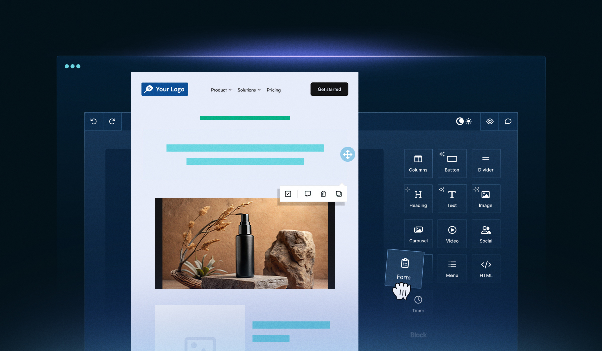
Designing the perfect popup with Unlayer is easy peasy. It offers an intuitive drag and drop popup builder, which allows you to create popups within no time.
All you have to do is embed the editor into your existing application, and you’re good to go.
It has a wide array of customizable design options, such as font selection and color schemes, so creating the desired look can be achieved with ease.
First off, the size of your popup should be adjusted to fit your needs. You can employ different sizes for different types of content, such as videos or images, and decide how much space you want to dedicate to any informational text or images you might include in the popup.
Wanna see the editor in action?
Well, this is how it looks like.

Once you have sized up your popup appropriately, it’s time to add content. Unlayer allows you to add elements such as images and videos, text boxes for information, or forms for collecting visitor data.
You can also customize each element’s appearance by selecting from a range of fonts and sizes and adjusting its color.
Finally, after all the design decisions have been made and all the elements are in place, Unlayer also offers a variety of handy features that allow you to test your popups before you launch them live.
You can preview how your popups will appear across different screen sizes and see how long it takes for them to load in various browsers, such as in Brave or Chrome, to ensure a consistent and optimized user experience across different platforms.
In conclusion, designing the perfect popup with Unlayer couldn’t be easier. With its wide array of customization options and helpful features that make testing easy and intuitive, anyone can create an ideal popup tailored towards achieving their goals without too much fuss.
Popup design is an integral part of a user's experience on the web. A well-designed popup can draw attention, provide useful information, and encourage users to take action. Here are some real-world examples of popup designs that are effective:
This type of popup is designed to capture leads and build your list of contacts. Uniqlo cleverly plays around with its popup design and includes an opt-in form and a call-to-action (CTA) button that encourages its users to submit their email addresses in exchange for something like exclusive content or discounts.

This type of popup detects when a user is about to leave your website and displays an offer just before they go.
It’s usually used as a last resort tactic when all other attempts at getting their attention have failed, such as banner ads or page overlays. The goal here is to capture sales from visitors who might not otherwise convert to your site without being enticed by some kind of incentive or offer.
DigitalMarketer uses this type of popup to drive their visitors to create a free account with a strong CTA button that uses contrasting colors to bring attention.

This type of popup caters specifically to mobile users who may require different messaging than desktop or tablet users due to the constraints imposed by smaller screen sizes and interface elements like touch controls instead of mouse clicks or keyboard shortcuts.
Buffy does a great job optimizing their popup for mobile devices by keeping the design minimalistic and emphasizing the discount offered in the popup copy.

Welcome popups can capture user information and get people to sign up for newsletters or other services. They’re also used to promote products, offer discounts, or even just as a simple greeting.
And Grab Green Home uses visuals simply yet effectively to create a visually appealing and engaging popup that makes their website more memorable. Also, the conversational style of their copy is a plus to make the visitors provide their information.

Popup designs are an important part of any digital marketing plan as they provide a way to capture leads while providing helpful information to potential customers.
By taking time to create well-crafted popups with great visuals and clear messaging that is relevant to each page it appears on, you will be able to optimize user experience while still capturing valuable data from visitors who may not have been interested in making a purchase at first glance.
Try out different popup designs until you find one that works best for your business goals.
Insights on email design, content creation, and developer productivity.
Compare the best email builder tools — Unlayer, Beefree, Stripo, Topol.io, Postcards, and Chamaileon — by features and pricing, and see why Unlayer leads.

A complete guide for developers and designers to create responsive, high-performing landing pages with expert tips, real examples, and technical best practices.
Looking to build CRM landing pages for lead generation? This blog walks you through the process step-by-step, helping you capture leads and boost conversions.