Best Email Builder Tools in 2025: Features & Pricing Compared
Compare the best email builder tools — Unlayer, Beefree, Stripo, Topol.io, Postcards, and Chamaileon — by features and pricing, and see why Unlayer leads.

You painstakingly create the perfect email. The email copy is straight out of some Shakespearean novel. The design should be displayed in the Louvre.
But what’s the point if all your readers can’t view and enjoy your masterpiece? In other words, your email isn’t accessible to them.
That’s why it’s important to talk about email accessibility - because more people than you know are affected by some form of disability and that dramatically changes how they experience your email.
According to the World Bank, 1 billion people globally have some type of disability. That means 15% of the world’s population - a truly staggering amount.
How can you change your email marketing to ensure that it is accessible for all? That’s what we’re here to discuss, so stick around.
Email accessibility is the process of removing barriers from your emails so a larger audience can access, use, and experience your message, irrespective of any disabilities they may have.
Still wondering why email accessibility is something you should consider? Let’s take a closer look at different disability stats to fully understand the gravity of things and why they matter:
Globally, some 2.2 billion people experience varying degrees of visual impairment
Globally, around 8% men and 0.5% women have color vision deficiency, meaning 1 in 12 men and 1 in 200 women are color blind
20% of the population is affected by dyslexia
The list goes on and on.
What does this tell us? There’s a good chance a considerable chunk of your audience can’t access your emails. What do you do about that? Don’t worry, we’re here to help with that.
The longer you keep sending out inaccessible emails, the more you’ll see your audience base diminish and your brand image suffer. So, in the spirit of keeping up with the industry, it’s time to move towards accessibility. Here are 5 reasons why.

In all your email marketing efforts, it’s important to remember that your readers are real people, not just inconsequential names on your list. And as real people, they face real problems, such as different disabilities.
Understanding your readers’ problems and designing around them shows your audience how you are aware of these disabilities and are trying your best to accommodate them. In other words, your readers get to see that you actually care.
This works out great for you, too, since showing such a high level of care for your readers automatically increases customer loyalty toward your brand.
Right now, a portion of your audience isn’t going through your email or taking the action you want them to because they simply can’t. Your email makes little sense to them, so they literally cannot do what you want them to. They can’t click subscribe, place another order, shop your sale, or anything like that.
This means currently, your ROI is way less than what it could be.
The obvious solution? To cater to that neglected audience segment. The only way to do that is to improve accessibility. You’ll automatically see your ROI increase as well, then.
If your readers can’t easily read your email or interact with the Calls To Action (CTAs), your engagement is bound to go down. The same readers probably aren’t going to stick around for future emails either. Because who wants to keep receiving emails they can’t view or read?
There is a way around this. You guessed it: accessibility. The better designed your email is for all to access, the more email engagement you’ll see.
Imagine this scenario. You’re temporarily impaired because you broke your arm running down the stairs. You get 2 emails about an ongoing sale. One uses clear, big fonts and images, so you know what’s happening.
The second one is more of an issue to navigate through. The font is tiny, so you keep having to zoom in while you’re only using one hand. Naturally, you get frustrated and give up. Possibly delete the email and curse the brand that sent it, just for good measure.
Wow, we wonder which email got the competitive edge over the other?
Your email doesn’t have to be fancy and full of the latest graphics to get a competitive advantage. Sometimes, being easy enough to read and understand is good enough.
With accessible emails, no one gets left behind. You reach out to everyone on your email list, including the audience segment with permanent disabilities or temporary impairments. Naturally, you’re reaching out to more people now that 100% of your list can experience your emails.
When discussing email accessibility, it’s essential first to know the various types of disabilities you need to cater to. Let’s look at the 6 main forms everyone should know about.

Visual disabilities include loss of sight, blurred vision, sensitivity to brightness, and color blindness.
Common workarounds include knowing how to design emails that are compatible with screen readers, using large enough font sizes, and choosing the proper color contrast. We’ll talk about all these in greater detail later.
Auditory disabilities include individuals that are deaf or hard of hearing. Someone with this disability might be sensitive to different sound volumes and frequencies, therefore opting to keep the volume at zero.
The trick for email marketers is to figure out how their video-based or podcast emails can still make sense without any sound involved.
Speech disabilities include individuals who cannot produce speech patterns easily recognizable by others or by software, such as muteness or stuttering.
If your email requires the recipient to take some action by calling a mentioned number, make sure you add alternatives for individuals with speech impediments. Possible options include a live chatbox, contact form, or even just replying to the email.
Neurological disabilities affect the central and peripheral nervous system, meaning the brain, spinal cord, etc.
The associated impairments are endless, but the ones you as email marketers should know of are epilepsy, memory loss or lack of retention, strokes, and tremors.
Possible ways to design accessible emails include not requiring precise actions for someone with tremors and avoiding flashing GIFs that could cause seizures.
Cognition relates to how our brains gather, understand, and retain information. So cognitive disabilities revolve around mental limitations that affect attention, memory retention, or comprehension.
In lieu of these limitations, it is vital that your emails don’t include any technical terms or complicated essays that are hard to understand. Keep it clear and straightforward.
Lastly, let’s not forget any temporary impediments that may be a nuisance for your readers. These impediments are basically less-than-ideal situations that make it difficult for your reader to experience the email. Here’s what these hindrances can look like:
Misplaced glasses
Broken arms
Not being able to watch the video with sound
Opening the email in bright sunlight
Slow internet connection
Now that you know what sort of disabilities to remember let’s go over some email accessibility best practices that’ll help you create enjoyable designs for all.
Individuals with visual or cognitive disabilities typically use screen readers to read emails. But it’s not just them. Even people who might be missing a limb or simply in a hurry use screen readers because it’s easier than doing it yourself.
So if a screen reader is vocalizing your message and all other elements in your email, it’s essential to know how these readers work. Let’s start.
Screen readers read out content one item at a time. So while we might just browse over an email to understand the gist of it all, screen readers spend longer reading out every single item step-wise.
Here are some other ways that screen readers vocalize content:
Pause for periods, commas, and semi-colons as a human would
Pronounce other special punctuation marks like the @ sign in an email address
Mention the email title
Sometimes, they pronounce acronyms instead of spelling them out, so it’s good practice to type out the acronym once in your email
Announce headings and heading levels, e.g., heading level 3, which is why you should break the email copy with different headings
Can’t read out an image, so they rely entirely on alt text to explain the image
One last thing to know is how image-only emails affect accessibility. If your entire email is just an image, then even the alt text isn’t enough for screen readers to appropriately describe the point of the email.
Also, if your Call To Action (CTA) is inside the image, the screen reader won’t be able to announce it. Consequently, your recipient won’t be able to take the desired action, inevitably leading to decreased engagement.
Your subject line lets your recipients know whether the email is relevant to them or not. Which makes writing the perfect subject line super tricky. On one hand, you want the subject line to be flashy and exciting. On the other hand, it needs to be descriptive, so people know what it’s actually about.
The best subject lines combine both these factors together to create something witty yet informative. When we say informative, we don’t mean you should add unnecessary jargon and other technical terms in there. You want to keep it simple for everyone to understand.
Try staying away from abbreviations and acronyms as well, both in your subject line. This might just unnecessarily confuse the screen reader.
Let’s look at what voice assistants and screen readers might say when vocalizing emails:
As you see, the preheader is just as important as the subject line, and the same best practices apply to preheaders too.
Colors sure do make your email look good, but what about someone who can’t see those colors? This is why you should ensure that color isn’t the only way important information is conveyed or highlighted.
Color contrast is another element to consider. Low contrast between the background and main copy makes it harder for people with color blindness or other vision impairments to make sense of the email. The contrast isn’t limited to the copy and also pertains to any images you use.
There are several tools available online to help you figure out the contrast between 2 colors, such as this site aptly called Contrast Ratio.
According to Web Content Accessibility Guidelines (WCAG) standards, there needs to be a minimum contrast ratio of 4.5:1 for standard-sized text and 3:1 for text larger than 23px. Try keeping these standards in mind when picking colors for your emails.

This one is intuitive - the smaller the font size, the harder it is for your recipients. Especially for the recipients that aren’t wearing their glasses, are partially blind, or are going over your email in the bright sun.
Typically, the font size should at least be 14px for desktop and 16px for mobile. However, this isn’t set in stone, of course. In certain instances, you might need to use an even larger font, especially when using a lightweight font.
Most typography best practices aren’t just limited to creating accessible emails and are more so just good design practices you should incorporate into all your emails.
Can you read this?

Of course, you can’t; no one can.
Just an example of precisely what not to pick when looking for readable fonts.
We get it - there are tons of decorative, cursive, or quirky fonts out there, so why stick to old-timey Times New Roman? But what’s more important, using a pretty cursive font or making sure your recipients can actually read your email?
Here are 2 words you may not have heard before, but it’s about time you learned: kerning and leading.
Don’t freak out yet. Let us explain.
Kerning is the horizontal spacing between 2 characters or letters. Leading is the vertical spacing between different lines.

If you don’t adjust the kerning and leading, everything will seem cluttered and might be illegible to read for some. In other words, ensure your text is well-spaced out, so it’s easy to read.
Now that we’ve told you what sort of fonts to stay away from, it’s only fair that we tell you about the best fonts to use as well.

Humans are used to scanning text from one side to the other across the page. When a line ends, it’s easy to find your way back to the starting line.
All of that goes out the window when you center-align something. The text doesn’t remain easily scannable anymore since the start of each line is aligned inconsistently. Center-aligned text is also more challenging for dyslexic people to consume. So always try to left-align your text, even if center-align looks better.
For people with cognitive disabilities, you need to make your email copy as simple and easy to read as possible. Don’t stuff it with unnecessary mumbo jumbo, or unclear instructions.
Here’s what to focus on when writing your email copy:
Keep your writing to a grade 8 reading level, which means 85% of the population can easily understand it
Stay consistent with the terms you use. For example, if you’re using the term “senior citizens,” don’t later replace it with “the aged” or something like that
If you use a new expression or some technical term, make sure you define it
Break your email copy into various headings, shorter paragraphs, and bullet points wherever possible
Usually, the only difference between regular text and a link is the font color. However, if someone is colorblind, it can be difficult for them to distinguish between the 2 based on color alone.
This means all your CTAs and links will go unnoticed if you don’t highlight them with something other than color. The least you can do is to always bold or underline such information to make sure it stands out against the background.
Screen readers vocalize images by reading the alt texts since there’s no way they can read the image itself. However, most email marketers treat alt texts as nothing more than a few words about a picture. Something you just add because you have to, and not because you believe it helps.
That isn’t the right way to go about it anymore. Email accessibility calls for descriptive alt texts. Because remember, for some of your recipients, this is all they have to figure out about what your email says.
Don’t write a boring alt text just for the sake of it, like, “Image highlights our latest summer collection.”
Instead, write an alt text that will help your audience “see” the image even without actually seeing it. For example, “The image highlights best pieces from our latest summer collection, including a women’s lilac cotton blouse with puff sleeves, paired with white dress pants and black beach sandals.”
The whole focus of semantic elements is to reinforce the meaning of your content rather than its appearance. It might sound complex, but you don’t have to be a coding guru to get the hang of it.
Here are examples of non-semantic elements that tell you nothing about the content: <div> and <span>.
On the other hand, here are some semantic elements that clearly define the content: <footer>, <table>, and <summary>.

There are 2 basic semantic elements all beginners should know:
<h1> for the first heading, <h2> for the second one, and so on
<p> for paragraph tags
Adding all these semantic elements makes it easier for screen readers to differentiate between different text types. This makes for a more enjoyable experience for all your recipients, irrespective of their impediments.
If your recipient is hard on hearing, stuck on a noisy subway, or in a super quiet library, how will they play the video in your email?
An easy email accessibility hack is just to add captions to all your videos from now on. This way, your readers can have an informative experience without relying solely on audio.
Apart from the captions, also pay attention to the video content itself. Use an appropriate font style and size, try steering clear of fast-flashing content, and make sure there’s a good contrast between the colors. In short, incorporate all the email design best practices we mentioned above.
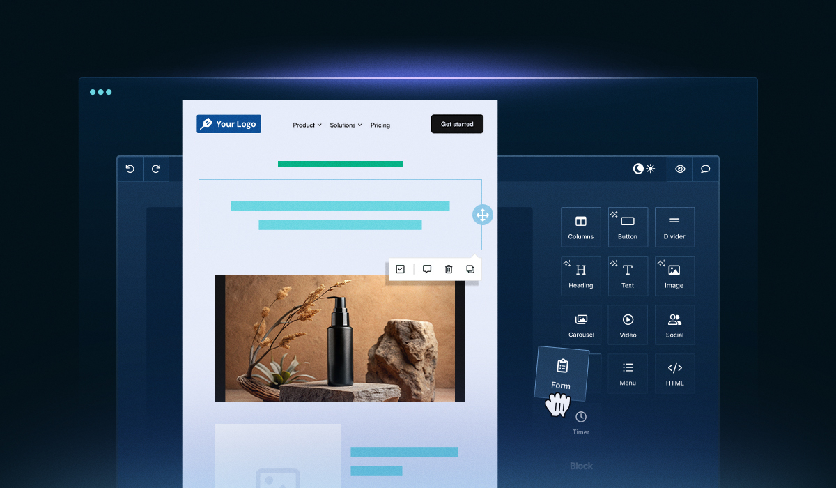
Creating an email from scratch while incorporating all these accessibility best practices can be difficult and time-consuming. Instead of driving yourself insane trying to perfect your email, make life simpler with Unlayer’s email builder.
The user-friendly drag and drop editor lets you add all the elements necessary for accessibility. For example, you can change all the colors in your design, as long as there’s enough of a contrast between them, of course.
You can embed images, GIFs, and videos and write alt texts for all of them. Custom blocks help you save time, letting you create and save blocks to reuse in future emails. The best part is that you can effortlessly export your designs to all leading ESPs (Email Service Providers).
Once you read up about email accessibility, you learn that it really isn’t that hard. All it takes is the smallest of things that have a huge impact on your audience. One tiny change, such as writing a thoughtful alt text or excluding a distracting GIF, can do wonders regarding accessibility.
We’ve covered everything you need to know about email accessibility. All that’s left is to hit the drawing board and figure out how you can make life easier for your readers.
Insights on email design, content creation, and developer productivity.
Compare the best email builder tools — Unlayer, Beefree, Stripo, Topol.io, Postcards, and Chamaileon — by features and pricing, and see why Unlayer leads.

A complete guide for developers and designers to create responsive, high-performing landing pages with expert tips, real examples, and technical best practices.
Looking to build CRM landing pages for lead generation? This blog walks you through the process step-by-step, helping you capture leads and boost conversions.