Your email campaigns deserve your undivided attention and efforts to ensure they deliver the fruit. However, it is a challenge that soaks up your time and energy every time you sit down to design your next email. To boss this play, you need to get your hands dirty with email templates.
Bring justice to your email marketing efforts using email templates that will help you save a lot of time. Think about it. Email templates can help bring brand consistency, not make you design everything from scratch, save time, and elevate your productivity.
In this article, you get 10 tips that will help you boss email templates.
How Does Building Email Templates Help Your Campaign?
Most email campaigns follow a theme, a generic flow, and a pattern of ideation that applies throughout the campaign. Defining templates for your campaign allows you to design only once and reuse the templates for emails of your entire campaign for as long as you wish.
It also reduces the chances of errors with color combinations and font sizes and makes it easier to maintain brand consistency throughout the campaign. Not using templates can also make you gradually lose the intended branding in your emails, affecting your branding.
There is more; sometimes your marketing campaign is intended for different segments of your email list. That's when you need to replicate your efforts without putting in all the work again, and an email template can be highly beneficial.
With this, you should be ready to build email templates that boost your campaign.
10 Result-Oriented Tips For Building Email Templates
Designing email templates can be a head-scratcher. There are tons of elements to be included, and you've got to align them perfectly to ensure the templates deliver to their maximum potential.
The following ten practices will likely make this bumpy ride smoother.

Make your templates responsive
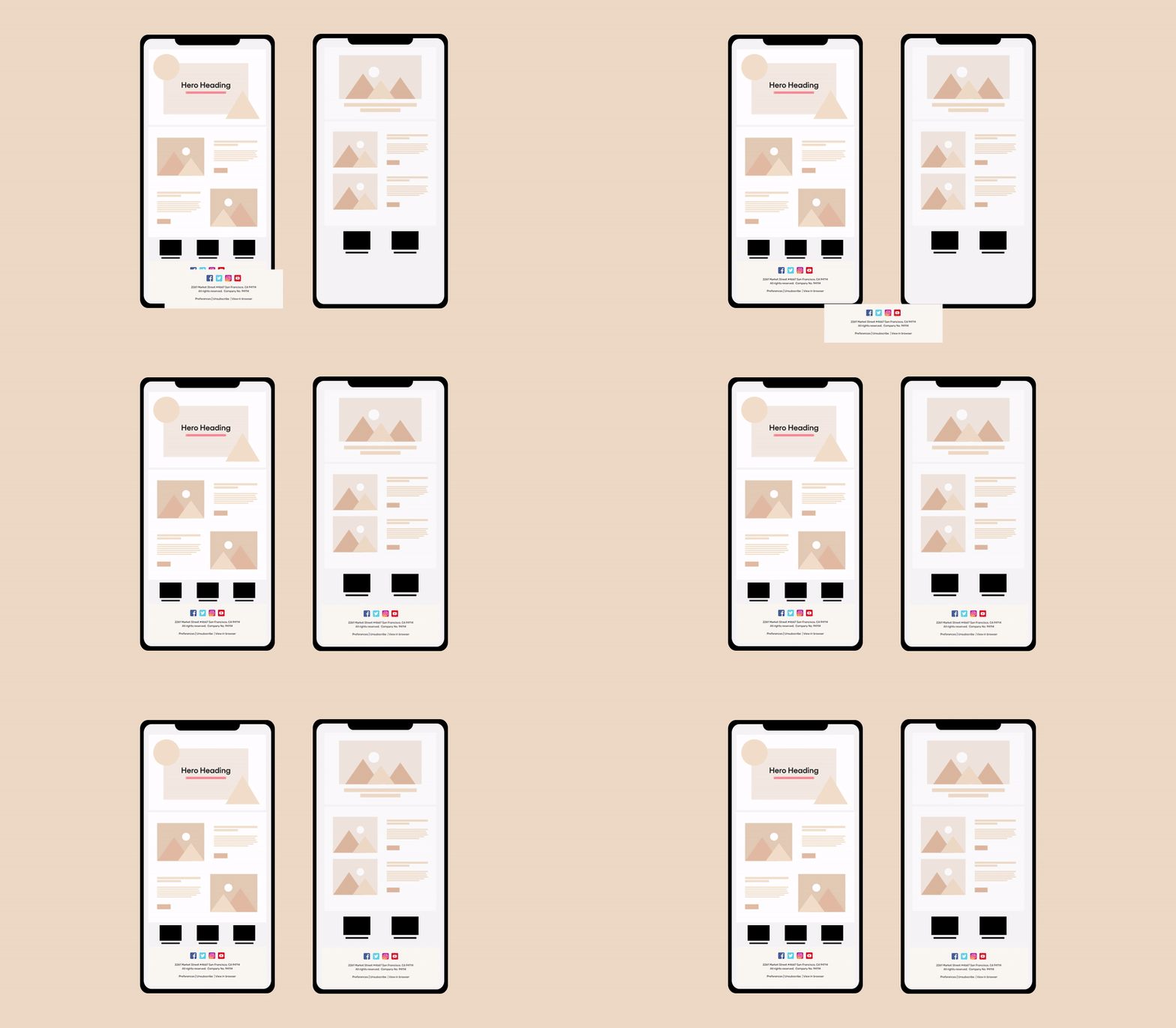
Since 47% of the users view their emails on a mobile device, ensuring your emails are responsive is vital to any marketing campaign. You wouldn't want your viewers to skip the email just because it is not designed for a particular screen size. Therefore, responsiveness is an essential element to have in your email templates.
The image game should be on point
Images in email are the cool attention grabbers that must be placed carefully. The correct use of images will have recipients jump in after the first glance and get excited about what the email offers. Care to juice the fruits a little more? You can make your emails more interesting by using background images too.
It is also important to consider your email's load time when adding images to your templates. Keeping the graphics minimal that amplify the content of the email is the recommended practice.
The following email template is a great example of using images in your email:
[

](https://unlayer.com/templates/family-fun-month)
Use simple fonts
The choice of font and font size can significantly impact the readability of your email. You wouldn't want your subscribers to struggle their way through your email and lose interest. Surveying through font families and different fonts can help you determine the best font for your email template.
You should also test your email templates for each device to ensure the font and font size are readable.
The example below helps how simple fonts can make your email readable:
[

](https://unlayer.com/templates/satisfaction-guarantees)
Find a balance between buttons and hyperlinks
Hyperlinks are highly likely to go unnoticed as they can easily blend in with the text. So hyperlinks are only used for non-primary links in the email. The significant links you want to bring more attention to are placed as buttons.
This means that you will use the less valuable redirections as hyperlinks in your email, but the essential ones go out as buttons.
CTA is clear and visible
An email template's content flow and design is all planned and plotted to make the user click your call to action buttons. However, that is impossible if your CTA hides in one corner of your email where most people might not even look.
You need to ensure clear visibility for CTA by aligning it to the center of your email and keeping white spaces around it to bring more attention. You can further amplify the visibility by resizing the button to make it more visible and picking a bright color.
Your templates must load fast
Emails that load faster are likely to maintain the user's interest at the same intensity. A good load time for any email is 2 to 4 seconds depending on the internet connection used to display it.
You can ensure a good load time by keeping the use of images minimal and reducing the number of embedded links and attachments in your email.
Make most of the brand elements
The primary purpose of designing email templates for your campaign is to make branding easier and more consistent. Start by defining a brand guideline for your emails which includes identifiable elements such as color scheme, fonts, image guidelines, brand tone, and any other element that you feel is vital to your brand's identity.
With the proper use of brand elements, your business can take up a special place in the user's mind because of its unique identity. This will increase their chances of considering your name when the relevant need arises.
Take the example below to give you a clear idea of how brand identity works in emails:
[

](https://unlayer.com/templates/brand-awareness)
Keep them campaign focused
Many amazing ideas will inevitably float in your mind when designing email templates. The excitement to include such a new idea that expresses your creativity is booming so high at that moment that you are likely to deviate from the campaign.
Therefore, defining guidelines for the campaign and sticking to them is very important to ensure your templates remain campaign focused.
Review content flow
The content flow of any email refers to how well the content, design, and copy of the email sit together collectively. An important thing to keep in check is the length of the copy and how it fits with the design of the email.
Remember to consider the content flow of your email for each device to avoid any inconveniences for your users.
Always test before sending
Testing is the final phase to ensure no errors in your email. Always consider the following pointers when testing your email template:
Test against different email service providers to ensure maximum compatibility.
Check if your email ends up in spam and see if you can fix it.
Review the email content and ensure no broken links or design elements exist.
Testing your email will help you live the experience your customer goes through and helps ensure that it is up to your standards.
To put these practices into motion, you need, at your service, a cool email template design tool, and Unlayer jumps in to aid you.
Why is Unlayer The Perfect Tool to Build Your Templates?
Unlayer is an easy-to-use, intuitive platform for creating customizable and engaging email templates. With Unlayer's drag-and-drop editor, users can quickly and easily create beautiful emails featuring their own branding elements, such as logos, colors, fonts, images, videos, and more.
Additionally, Unlayer allows users to preview their designs on desktop and mobile devices so they can make sure their emails look great across all platforms.
If you do not feel like designing from scratch, Unlayer has got for you a gallery of 1,500+ email templates. Just find the one that suits your needs the best and requires minimal editing, and your campaign is set to go.
Wrap Up
Given these tips to build email templates and a fantastic tool at your availability with a free 14-day trial, you're more than ready to design your templates. Launch your campaign and see your email marketing compete with the best in your subscribers' inboxes.


