Visual Storytelling in Emails: 5 Layouts for Impactful Design
Master the art of visual storytelling in emails with our detailed exploration of 5 unique email layouts and effectively engage your target audience.

![10 Tips to Improve Visual Narrative in Emails [+ Bonus Tool]](https://images.ctfassets.net/eut50lk49cau/61Zq0qIK3SFMkBnOOkdhf7/5f23276773848f3b9bdcf8f57f0ab3cf/visual-narrative-in-emails.png)
Think about what catches your eye when you first see an email in your inbox. It’s often the subject line, but once you open it, what keeps your attention?
It’s the stunning visuals that make you want to read more. Visual narratives in emails have become a key strategy to make your messages stand out in crowded inboxes.
But the question is, what kind of visuals can you use to spice up your emails?
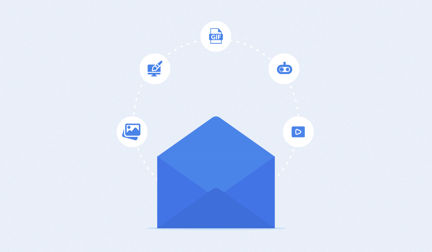
You can consider:
images that tell a story,
videos that bring your message to life,
graphics that highlight key points,
infographics to break down complex information,
GIFs to add some fun,
gamification elements to engage your audience interactively,
illustrations to personalize your message,
and even memes to bring a smile to your readers' faces.
Each type of visual plays a unique role in making your emails more compelling.
And in this article, we’re going to dive deep into 10 proven tips to enhance your visual narrative in emails. So, you can create emails that not only look great but also resonate with your audience and boost your engagement rates.
Ready to transform your emails from bland to brilliant? Here are 10 surefire tips to elevate your email visuals.
Playing around with images can impact your email deliverability. Therefore, when using images in emails, keep the following tips in mind.
Selecting the appropriate image format is crucial for effective email visuals.
JPEG: Ideal for photos with vibrant colors and smaller file sizes.
PNG: Best for images with transparent elements, logos, and icons.
SVG: Suitable for high-quality images, but ensure the file size remains small.

Using the right format enhances image quality and loading speed, improving the overall recipient experience.
Avoid image-only emails due to the risk of email image blocking, where users may not see your images at all. This feature can be a default setting at the receivers’ end, leaving your subscribers with no information if your email lacks accompanying text.
While there's no ideal ratio, most marketers aim for images to make up 20% to 50% of email content. Exceeding 50% can trigger spam filters, while over 80% of text can make the email hard to read.

To maintain a balanced text-to-image ratio, consider the following two rules:
For emails with 500 characters or less, include just one image.
For emails with more than 500 characters, feel free to add multiple images.
Balancing text and images ensures your message is clear and reduces the likelihood of ending up in the spam folder.
Related: How to Avoid Spam Filters in Emails? 20 Fool-Proof Methods
Add descriptive alt text to your images. This is important for accessibility and helps your recipients understand the content of the email even if the images don't load.
While stock photos can be useful, avoid overused or generic images. Unique, authentic images are more likely to capture attention and feel genuine.
You can also use images that align with your brand’s visual identity. Consistency in style, color, and theme will help reinforce your brand’s image.
Including videos in your emails is particularly useful in conveying complex information. People actually understand a product or website better when they watch a video. This is not just all talk, as 91% of people actually do so.
It is suggested that you convert your videos into MP4 before embedding them into your emails.
Choose an eye-catching thumbnail that entices your recipients to click and watch. The thumbnail should be relevant and visually appealing to increase click-through rates.
Including a play button overlay on the thumbnail signals to recipients that there’s a video in your email. This can boost engagement by making the video element more apparent.

Source: Going
Compress your video without sacrificing quality to ensure it loads quickly. Slow-loading videos can deter recipients and reduce engagement.
Instead of embedding the entire video, use a GIF or an image with a play button that links to the full video hosted on your website or a platform like YouTube. This ensures compatibility across all email clients.
Not every GIF and animation will necessarily boost your conversion rates, and finding the relevant ones can be a tedious task.

But we’re here to help you with the below tips.
If your GIF or animation is too heavy, it may cause slow email loading times or even be unsupported by some email clients.
Therefore, aim to keep your GIFs between 200 to 250kb and use a compressor tool to reduce the file size if needed.

Avoid adding GIFs and animations just for the sake of it. They might confuse and frustrate your audience. I mean why create visual noise, right?
Only include them when they reinforce the message of your email and have a purpose to fulfill.
Don't overuse GIFs in emails. While they are fun, too many can slow down loading times and distract the readers from your message.
We suggest using one GIF in shorter emails and up to three in longer email newsletters.
Ensure that the GIF and animation you use align with the overall aesthetic of your email and brand style.
If your brand is minimalistic, avoid flashy GIFs. Instead, create your own GIFs and animations to help you maintain color and design harmony.
The following email from Loft perfectly demonstrates the above principle.

Source: Loft
Tailoring your visuals to specific segments ensures that your emails are relevant and resonate with each group's interests and preferences.
Here’s how you can segment your target audience for a better visual narrative in emails.
Segment your audience based on
➜ age,
➜ gender,
➜ location,
➜ and occupation.
So you can tailor email visuals to specific demographic groups.
Use data on past interactions, purchase history, and engagement metrics to create segments that reflect different behaviors and preferences.
For instance, by analyzing past interactions and purchase history, you can identify customers who have added items to their cart but have yet to complete the purchase.
This profiling allows you to tailor your email visuals to highlight the abandoned cart products, include enticing images, and offer personalized discounts or reminders to encourage them to complete their purchase–just like in the email example below.

Source: Little Beast
Consider the lifestyle, interests, and values of your audience to design visuals that resonate on a deeper emotional level.
For example, if you're targeting a segment of eco-conscious customers, consider using visuals that emphasize sustainability and environmental responsibility.
Use images of nature, eco-friendly products, and messages about your brand's commitment to green practices. This approach taps into their values and lifestyle, creating a deeper emotional connection and making your content more relevant and engaging.

Source: Old Pal
Use colors that align with your brand identity to create a cohesive and recognizable look. Consistency in color usage helps reinforce your brand and build trust with your audience.
Maintain a balanced color palette to ensure your emails are visually appealing without being overwhelming. Too many colors can be distracting, while a well-chosen palette simply upgrades readability and focus.
Choose colors that evoke the desired emotional response. For example, use warm colors like red and orange to create excitement or cool colors like blue and green to convey calmness and reliability.
Ensure proper and balanced contrast between text and background colors to improve readability in your emails. Poor contrast can frustrate your recipients, leading to higher deletes or unsubscribes from your email list.
Plus, stop using light-colored text against a light background to maintain readability and engagement.

It’s essential to use colors strategically to guide your readers’ attention towards specific email elements.
Select colors for headers and banners to establish a strong first impression.
Ensure text and background colors contrast well for readability.
Highlight Call-to-Action (CTA) buttons with bold, attention-grabbing colors to maximize their visibility.
A well-structured visual hierarchy is essential for highlighting the most critical information, ensuring that your primary message isn't overlooked. This also makes your email’s content easier to scan and digest.
Larger elements naturally draw more attention. Use larger fonts for headlines and smaller fonts for body text. This helps establish a clear visual email structure.
While you might be tempted to use fancy web fonts to showcase your brand's message, what if they fail to load for your recipients? That's a risk you don't want to take.
So, stick to email-friendly fonts.
Don't overcrowd your email, and be friends with the white space. Adequate white space around elements helps them stand out and makes your email easier to read and less cluttered.
People often scan emails in an inverted pyramid pattern (top to bottom) or zig-zag pattern (diagonal). To capture attention, place your key elements, such as headlines, images, and CTAs, along these paths.

Each section of your email should have its own mini-hierarchy. For example, within a product section, the product name should stand out first, followed by the description and then the price.
An email without interactive elements is like a sundae without the cherry on top - it still works, but it lacks that extra touch of delight.
So, follow these tips to transform your plain, boring emails into something fun and engaging.
It is one of the quickest ways of collecting valuable feedback directly from your subscribers via email.
You can embed forms and buttons that link to survey pages or create a poll directly within the email.

Source: Welkom
While it’s tempting to design fun and unique buttons, straying too far from what’s expected can confuse your subscribers and reduce click-through rates. Even if the text indicates something is clickable, visual cues are crucial.
Use standard button shapes to ensure you capture your audience’s attention, especially for those who are quickly scanning the email. Standard shapes include:
➜ Rounded corners
➜ Square corners
➜ Pill-shaped
➜ Ghost button
➜ Shadowed button
This doesn’t mean you can’t add creativity to your buttons. And that’s exactly where CSS animated buttons come in.
For example, you can take a look at how Magic Spoon used animated GIFs in their buttons to draw extra attention.

Source: Magic Spoon
Gamification email marketing is one of the coolest trends you can follow to add some extra charm to your email visuals.
There are several ways to gamify your emails like using:
➜ wheel of fortune
➜ quiz
➜ scratch card
➜ scavenger hunt
➜ puzzle
➜ slot machine
However, don’t forget to test your emails before sending them. All of your hard work will go to waste if your emails don’t render well on different email clients.
Plus, don’t overcomplicate your quizzes and puzzles. If they’re too difficult to solve, your emails won’t achieve the targets you’ve set.
Here are five tips you should follow to express urgency in your emails through countdown timers.
➜ Add dynamic countdown timers that update in real time for limited-time offers or product launches.

Source: Sunski
➜ Clearly indicate the end date and time for promotions or events.
➜ Customize countdown timers based on your recipient’s timezone to ensure accuracy and relevance.
➜ Ensure the countdown timer matches the overall design and theme of your email.
➜ Make the timer stand out by using contrasting colors. This draws your reader’s eye and emphasizes the urgency of your message.
➜ Experiment with different placements within the email to see where the timer performs best. Common spots include above the fold, near the CTA, or within the header.
➜ Showcase multiple products or images without overwhelming the reader. Include a carousel that users can swipe or click through.
➜ Create a narrative flow within the carousel. Each slide should logically follow the previous one to tell a compelling story.
➜ Don’t overcrowd slides with too much information. Keep text brief and images relevant to maintain clarity.
➜ Too many slides can overwhelm the recipient. Keep the content engaging and concise by sticking to 3-5 slides.
➜ Include visible navigation arrows and dots to indicate additional slides. This helps users easily navigate through the carousel.
Have a look at an example of image carousels in emails:

Source: L'Orangerie
Including alt text, short for alternative text, in your email graphics is crucial for effective email marketing.
Alt text provides a textual description of your visuals, which is essential for accessibility, especially for visually impaired people and those who have multimedia turned off by default.
Moreover, alt text enhances usability as tools like Siri and Alexa can read these descriptions aloud, helping people who listen to emails while driving.
To make the most of alt text, keep it concise yet meaningful. This practice ensures that everyone, regardless of how they access your email, understands the content.
Here's an example to illustrate the importance of well-crafted alt text:

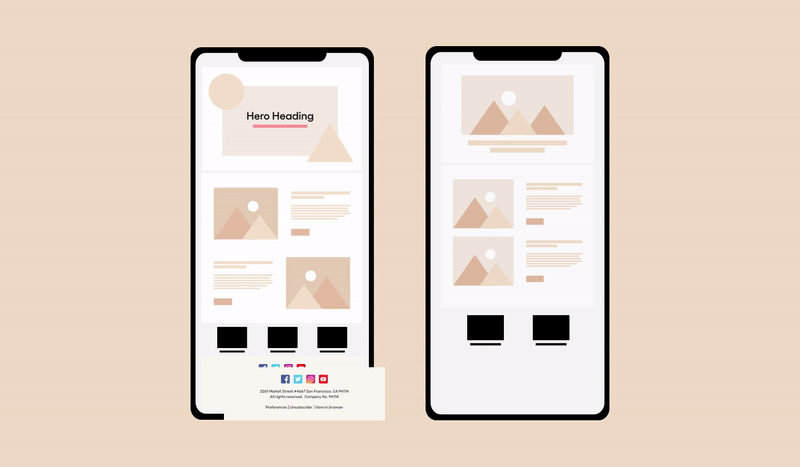
Nearly 1.7 billion people use mobile phones to open their emails. Therefore, we can’t emphasize how important it is to make sure your email layouts look good on all devices and email clients.
This means your email visuals should work well everywhere.
To make this happen, use responsive email designs that are simple and easy to navigate so people can quickly see and understand your message regardless of the device they’re using.
Place your visuals next to a short, catchy text to get your point across fast.
By optimizing your emails this way, your messages become more engaging and accessible, making your visual storytelling stand out.
Last but not least, don’t forget to test your emails to ensure these are as effective as possible. Here’s how to conduct A/B testing for a better visual narrative in emails:
Choose specific elements to test, such as subject lines, images, colors, layouts, or CTAs.
Design two versions of your email, changing only one element at a time to isolate its impact.
Divide your email list into two groups that are representative of your overall audience.
Distribute the different versions to the respective segments simultaneously.
Measure performance based on key metrics like click-through rates, bounce rates, and conversions.
Apply the insights gained from the test to optimize your future email marketing campaigns and avoid all the email design mistakes you were making before.
Bonus tip: Remember to incorporate the latest email design trends to make the most of your email marketing efforts.
You've gathered all the ingredients to cook up a great meal, but where do you prepare it?
Unlayer will help you craft the most impressive email visuals your subscribers have ever seen.
It offers several advantages by providing an extensive array of pre-designed responsive HTML email templates alongside a robust built-in image editor.
With access to over a million images, you can effortlessly find the perfect visual for your emails. Moreover, you can enhance your designs with filters, text overlays, shapes, and stickers directly within the editor, ensuring each email is visually appealing and effective in driving conversions.
That’s not it. You can also add other visuals to your emails, like videos, GIFs, gamification elements, and whatnot with its intuitive drag and drop editor. This eliminates the need for manual code altogether.
Impressive right? So, don’t just wait; start designing your emails with Unlayer.
Insights on email design, content creation, and developer productivity.
Master the art of visual storytelling in emails with our detailed exploration of 5 unique email layouts and effectively engage your target audience.
Want to speed up your email creation process? Then, design and save custom blocks for your emails. This article covers everything you should learn about it.
From personalization to automation, discover strategies to connect with your audience and strengthen your personal branding via emails.