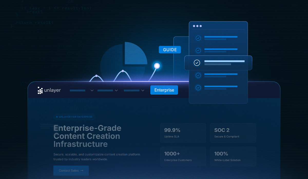
Unlayer Enterprise: Your Guide to Embeddable Tech at Scale
An in-depth Enterprise-focused overview of choosing an embeddable builder built for compliant workflows, flexible deployment, & fast team-wide content creation.

If you’ve ever built a landing page feature into your product, you know the pressure.
Marketers want something fast. Designers want something flexible. And leadership wants to see results. But too often, the builder launches with only the basics, one layout, limited control, and no real guidance on which types of landing pages to create.
Here’s what you’ll get in this guide:
A clear look at what landing pages are and why they matter for SaaS workflows
15 types of landing pages, with real use cases, examples, and handy tips
How to use Unlayer’s drag-and-drop builder to help your users create modern, responsive pages in minutes
A landing page is a standalone web page designed around a single goal, usually to convert a visitor by getting them to click, sign up, buy, or take the next step.
Unlike your homepage or feature pages, landing pages are distraction-free. That could be:
Signing up for a webinar
Grabbing a lead magnet
Clicking through to pricing
Confirming a referral
But, according to a study, 48% of website visitors leave the main landing page without engaging further.
Using the same type of landing page for every campaign goal often leads to this. If you're building landing pages inside a SaaS app, you need to match each page type to the outcome it’s meant to drive.
There’s no single “perfect” landing page layout, because not every campaign has the same goal.
Some pages are made to get clicks. Others collect emails, explain pricing, or simply guide the user to the next step.
This list covers 15 landing page types that marketers actually use across funnels—from first-touch awareness to post-conversion experiences.
Click-through pages help your end-users guide visitors through a warm-up stage before asking for a commitment. Instead of a direct signup or purchase, these pages highlight key benefits, features, or value props, just enough to earn the next click.
As a builder, offering this page type helps your users bridge the gap between ad campaigns and high-intent pages like pricing or checkout. It’s essential for funnels where timing and message alignment impact conversions.

Source: Asana
Tips for these types of landing pages:
Allow flexible headline blocks so users can highlight one clear benefit
Support visual content and modular sections to keep interest high
Let users place a single, styled CTA button after the core message
Skip form blocks for this template to keep the experience frictionless
This template is built to help your users convert traffic into leads, fast. Whether it’s a guide, early access, or a free consultation, the page should clearly and simply convey the value in exchange for contact details.
Your role is to make it easy for users to launch focused, lead-generating landing pages.

Source: Salesforce
Builder considerations:
Enable compact form blocks (email + first name as default)
Let users customize the lead magnet offer with text and visuals
Provide options to hide headers, navigation, and footers for a distraction-free design
A squeeze page is a highly focused landing page designed to capture a visitor’s email address with minimal distraction.
Commonly used for newsletter signups, waitlists, or limited-time offers, it removes navigation and extraneous content to maximize conversion.

Source: IBM
Implementation tips:
Preconfigure a single-field form (email only)
Allow users to disable headers, footers, and social links
Provide options for visual emphasis (e.g., bold CTAs, timers)
Offer editable copy blocks with character guidance
Sales pages present a complete narrative from highlighting the core problem to offering your solution. They walk visitors through key features, benefits, and proof points, addressing objections along the way.
These pages are often longer by design, but every section should serve a clear purpose and guide the user toward conversion.

Source: Microsoft
Builder-focused tips for this page type:
Include flexible content blocks for pain-point messaging and feature breakdowns
Let users easily drop in screenshots, testimonials, or social proof modules
Provide support for multiple CTAs across the layout, not just one at the end
Add pricing table templates with space for guarantees or FAQs nearby
These landing pages give individual products the focus they deserve, ideal for app launches, limited-time offers, or high-value items.
Unlike generic product pages, they’re designed to reduce distractions and drive conversions with targeted content and visuals.

Source: Unlayer
Tips for builders designing these pages for users:
Support decision-making with zoomable images or short demo videos
Add elements like variant selectors, trust badges, and reviews
Use sticky or repeated CTAs to maintain visibility during scroll
Want to help your users launch polished landing pages fast, without building an editor from scratch? Book a demo to see how Unlayer fits right into your app. Book a demo.
These pages help your users drive signups for webinars, demos, or live sessions. A well-built event registration page presents the event details topic, date, time, agenda, and speakers in a clear, structured layout that minimizes friction.

Source: Zapier
What to look for in respective landing page builders:
Focus on flexible content blocks, responsive layouts, and form integrations that simplify the sign-up process and reduce drop-offs
A confirmation page appears after users complete a key action, such as submitting a form or registering for an event. While its primary role is to acknowledge success, it also presents an opportunity to guide users toward next steps.
Confirmation pages are more than placeholders. Give your users tools to turn these moments into meaningful transitions, without needing developer intervention.

Source: Hubspot
Builder considerations:
Allow page creators to easily customize confirmation text without editing code
Support dynamic next steps, like download links, calendar adds, or onboarding triggers
Enable optional secondary CTAs (e.g., content links, share buttons) that feel native to the layout
Keep styling consistent with the rest of the brand experience automatically
Coming soon pages help your users create early momentum before launch. Whether it’s a new product, app feature, or limited rollout, these pages allow their audience to express interest, signups for updates, and stay engaged without requiring a full site.
Your users rely on these pages to gauge interest and grow early lists. Give them the flexibility to stay lean and launch-ready without needing extra tools or workarounds.

Source: Depology
Builder tips:
Allow creators to enable/disable countdown timers easily
Support short, focused copy blocks with bold headlines
Include native email capture with integrations or exports
Keep the editing panel minimal to match the page's clean design
When a simple layout isn’t enough, a microsite-style landing page gives your users room to explore. With scrollable sections and deep content, it’s ideal for showcasing a new product, campaign, or initiative, without sending visitors elsewhere.
Built well, it keeps the experience focused while letting users absorb the full story at their own pace.

Source: Dreamforce
Builder tips:
Support anchor-based navigation for smooth section jumps
Let users mix content types like video blocks, testimonials, and product grids
Offer sticky headers or section-aware CTAs for better conversion tracking
Optimize long pages for mobile load speed and tap targets
Splash pages act as a controlled gateway to your user’s leading site or app. Often used for regional targeting, announcements, or compliance purposes (such as age checks), they set the tone before visitors engage further.

Source: Zara
Builder tips:
Enable full-viewport layouts with flexible background support (image, video, color)
Offer simple logic blocks for conditional flows (e.g., pick a language, confirm age)
Allow auto-dismiss timers or skip options if needed
Use full-screen visuals to make an impact
A 404 page doesn’t have to end the journey. For your users, it’s a chance to recover lost traffic and re-engage visitors who missed their intended destination.
Whether it’s a quick redirect, a helpful search bar, or contextual product links, smart 404 pages quietly do the work of retention.

Source: Shopify
Builder tips:
Provide modular blocks for error messaging, search, and suggested links
Allow users to customize fallback CTAs, product carousels, or visuals
Offer styling tools to keep 404s consistent with the site’s brand theme
Include tracking options so teams can identify common drop-off points or broken paths
Referral pages turn users into growth channels. For your customers, it’s where advocacy starts, with a clean, compelling layout that explains how the program works and what’s in it for the referrer.

Source: Notion
Builder tips:
Prioritize a customizable reward banner or incentive block
Include editable steps (e.g., “Invite → Sign Up → Earn”) with icon or text options
Provide one-click sharing blocks with dynamic referral links
Allow for optional social proof modules, like testimonials or referral counts
Make the page embeddable within apps or emails, if relevant
A pricing page helps users compare options and choose a plan with confidence. It should present details clearly, remove friction, and support fast decisions.
For builders, the focus is on giving users flexible layouts and components that support transparency without overwhelming visitors.

Source: Zoho
Builder tips:
Include pre-built pricing tables with toggle support (monthly/annual, tiers)
Let users highlight a “most popular” or default plan
Add optional blocks for testimonials, plan-specific features, or comparison FAQs
Support dynamic plans via API or metafield integration if pricing is user-specific
A newsletter signup page has one clear function: convert interest into subscriptions. For page builders, the challenge is to create a layout that keeps the focus sharp, minimizes friction, and supports persuasive content.

Source: Slack
Tips for builders:
Use a lightweight form block with an optional first name field
Include a visual container for preview text, past issues, or testimonials
Let users customize CTA button copy, not just the label
Provide flexible section widths and text alignment for tighter storytelling
Ensure mobile responsiveness with auto-stacking layout blocks
Support inline validation for faster form completion
An “About Us” landing page isn’t just for storytelling; it’s a trust-building tool. It helps visitors understand who’s behind the brand, why it exists, and what values drive it. It’s especially powerful for new brands or high-ticket products.
For builders, the goal is to create a layout that feels human, trustworthy, and visually distinct from promotional pages.

Source: Mailchimp
Tips for builders:
Provide a flexible hero block that supports mission copy and a founder photo
Include a timeline or milestone block with adjustable icons and dates
Support multi-column layouts for team bios, press logos, or awards
Add rich media sections for embedded videos or behind-the-scenes images
Also Read: 17 Landing Page Mistakes That’ll Cost You Time, Effort & Money
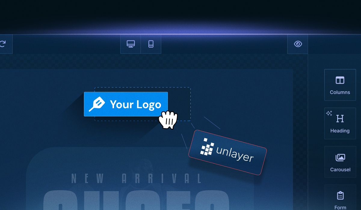
Creating landing pages shouldn’t require weeks of developer time or back-and-forth handoffs. With Unlayer’s page builder, your users can design and launch fully responsive landing pages using an intuitive drag-and-drop interface, no custom code required.
Whether you're building standalone campaigns or embedding a white-labeled builder into your SaaS, Unlayer makes it fast to go from concept to launch.
Here’s what you can build with:
No-Code, Drag & Drop: Design pages using a clean, intuitive editor, no technical skills required.
Mobile-Responsive Pages: Every layout adjusts seamlessly across desktop, tablet, and mobile.
AI-Powered Assistance: Get layout suggestions, optimize sections, and improve content flow.
Customizable Forms: Build landing page forms with flexible fields, smart buttons, and third-party integrations.
Content Blocks: Save reusable content blocks for consistent branding across all pages.
Advanced Features: Add countdown timers, embed custom code, and use precision styling tools.
Custom Tools: Extend the builder withyour custom tools from AI-powered features to bespoke content blocks.
Advanced Customization: Control every part of the experience from appearance and editor behavior to content settings. Tailor the builder to match your product's exact needs.
Unlayer gives you everything you need to launch faster and scale every campaign without starting over.
See how teams like yours build pixel-perfect landing pages. Schedule your Unlayer demo now.
Got questions on mind? Here are some frequently asked questions from other users. We’ve answered them to help you get clarity faster.
For SaaS teams rolling out a new product, Coming Soon, Microsite, and Click-Through pages are most effective. These formats help pre-qualify traffic, offer deeper education, and guide users smoothly toward a trial or signup.
Yes. With Unlayer’s embeddable editor, you can let users build and publish landing pages without leaving your platform. It’s white-labeled and integrates easily via SDK and plugins like React, Angular, and Vue.
Unlayer supports full visual customization, such as brand colors, fonts, layouts, and templates. You can pre-configure sections, lock brand elements, and offer custom blocks that match your product’s design system.
Lead Capture, Splash, and Click-Through pages are ideal for paid campaigns. They’re lightweight, match the intent of the ad, and reduce bounce with single-message clarity.
Absolutely. Unlayer lets you create and save multiple templates, like Thank You pages, Pricing pages, or Referrals, all from the same drag-and-drop workspace.
If you're embedding a page builder in a SaaS product, prioritize support for Lead Capture, Product Pages, and Microsites. These are the most commonly requested formats by marketing teams running recurring campaigns or client sites.
Insights on email design, content creation, and developer productivity.
An in-depth Enterprise-focused overview of choosing an embeddable builder built for compliant workflows, flexible deployment, & fast team-wide content creation.
A detailed guide on how Unlayer, a white-label builder for agencies, streamlines SMB marketing, boosts revenue, and simplifies client content creation.
Unlayer enterprise integration made simple with clear steps for embedding, customizing, and managing content across SaaS and on-premise platforms.